|
Large Print
Large-print (also large-type or large-font) refers to the formatting of a book or other text document in which the font size is considerably larger than usual to accommodate people who have low vision. Frequently the medium is also increased in size to accommodate the larger text. Special-needs libraries and many public libraries will stock large-print versions of books, along with versions written in Braille. The font size for large print is typically at least 18 points in size, equivalent to 24px for a web CSS font size. Different sizes are made to suit different visual needs, with a common rule of thumb to be at least twice the minimum acuity size. Publishing standards The American National Association for Visually Handicapped (NAVH) provides the NAVH Seal of Approval to commercial publishers in the US, for books that meet their large print standards. ( Lighthouse International acquired NAVH in 2010.) The standards call for: * Maximum limits on size, thickness, and weigh ... [...More Info...] [...Related Items...] OR: [Wikipedia] [Google] [Baidu] |
Font
In metal typesetting, a font is a particular size, weight and style of a ''typeface'', defined as the set of fonts that share an overall design. For instance, the typeface Bauer Bodoni (shown in the figure) includes fonts " Roman" (or "regular"), "" and ""; each of these exists in a variety of sizes. In the digital description of fonts ( computer fonts), the terms "font" and "typeface" are often used interchangeably. For example, when used in computers, each style is stored in a separate digital font file. In both traditional typesetting and computing, the word "font" refers to the delivery mechanism of an instance of the typeface. In traditional typesetting, the font would be made from metal or wood type: to compose a page may require multiple fonts from the typeface or even multiple typefaces. Spelling and etymology The word ''font'' (US) or ''fount'' (traditional UK, CAN; in any case pronounced ) derives from Middle French ''fonte'', meaning "cast iron". The term re ... [...More Info...] [...Related Items...] OR: [Wikipedia] [Google] [Baidu] |
Low Vision
Visual or vision impairment (VI or VIP) is the partial or total inability of visual perception. In the absence of treatment such as corrective eyewear, assistive devices, and medical treatment, visual impairment may cause the individual difficulties with normal daily tasks, including reading and walking. The terms ''low vision'' and ''blindness'' are often used for levels of impairment which are difficult or impossible to correct and significantly impact daily life. In addition to the various permanent conditions, fleeting temporary vision impairment, amaurosis fugax, may occur, and may indicate serious medical problems. The most common causes of visual impairment globally are uncorrected refractive errors (43%), cataracts (33%), and glaucoma (2%). Refractive errors include near-sightedness, far-sightedness, presbyopia, and astigmatism (eye), astigmatism. Cataracts are the most common cause of blindness. Other disorders that may cause visual problems include age-related macular ... [...More Info...] [...Related Items...] OR: [Wikipedia] [Google] [Baidu] |
Recording Medium
Data storage is the recording (storing) of information (data) in a storage medium. Handwriting, phonographic recording, magnetic tape, and optical discs are all examples of storage media. Biological molecules such as RNA and DNA are considered by some as data storage. Recording may be accomplished with virtually any form of energy. Electronic data storage requires electrical power to store and retrieve data. Data storage in a digital, machine-readable medium is sometimes called ''digital data''. Computer data storage is one of the core functions of a general-purpose computer. Electronic documents can be stored in much less space than paper documents. Barcodes and magnetic ink character recognition (MICR) are two ways of recording machine-readable data on paper. Recording media A recording medium is a physical material that holds information. Newly created information is distributed and can be stored in four storage media–print, film, magnetic, and optical–and see ... [...More Info...] [...Related Items...] OR: [Wikipedia] [Google] [Baidu] |
Braille
Braille ( , ) is a Tactile alphabet, tactile writing system used by blindness, blind or visually impaired people. It can be read either on embossed paper or by using refreshable braille displays that connect to computers and smartphone devices. Braille can be written using a slate and stylus, a braille writer, an electronic braille notetaker or with the use of a computer connected to a braille embosser. For blind readers, braille is an independent writing system, rather than a code of printed orthography. Braille is named after its creator, Louis Braille, a Frenchman who lost his sight as a result of a childhood accident. In 1824, at the age of fifteen, he developed the braille code based on the French alphabet as an improvement on night writing. He published his system, which subsequently included musical notation, in 1829. The second revision, published in 1837, was the first Binary numeral system, binary form of writing developed in the modern era. Braille characters are f ... [...More Info...] [...Related Items...] OR: [Wikipedia] [Google] [Baidu] |
Large Print Books
Large means of great size. Large may also refer to: Mathematics * Arbitrarily large, a phrase in mathematics * Large cardinal, a property of certain transfinite numbers * Large category, a category with a proper class of objects and morphisms (or both) * Large diffeomorphism, a diffeomorphism that cannot be continuously connected to the identity diffeomorphism in mathematics and physics * Large numbers, numbers significantly larger than those ordinarily used in everyday life * Large ordinal, a type of number in set theory * Large sieve, a method of analytic number theory ** Larger sieve, a heightening of the large sieve * Law of large numbers, a result in probability theory * Sufficiently large, a phrase in mathematics Other uses * ''Large'' (film), a 2001 comedy film * Large (surname), an English surname * LARGE, an enzyme * Large, a British English name for the maxima (music), a note length in mensural notation * Large, or G's, or grand, slang for $1,000 US dollars * Large, ... [...More Info...] [...Related Items...] OR: [Wikipedia] [Google] [Baidu] |
Lighthouse International
Lighthouse Guild is an American charitable organization, based in New York City, devoted to Vision Rehabilitation, vision rehabilitation and advocacy for the blind. Its mission statement is "To overcome vision impairment for people of all ages through worldwide leadership in rehabilitation services, education, research, prevention and advocacy." Formerly known as Lighthouse International, it merged with Jewish Guild Healthcare and as of January 2014 became known as Lighthouse Guild International, with the name eventually shortened to Lighthouse Guild. History During a trip to Florence, Italy, at the turn of the 20th century, sisters Winifred Holt, Winifred and Edith Holt learned of a free service that provided concert tickets to blind schoolchildren. Inspired by the notion, the sisters established the similar Lighthouse Free Ticket Bureau in New York City in 1903. The organization was incorporated in 1906 as The New York Association for the Blind and offered home counseling and ... [...More Info...] [...Related Items...] OR: [Wikipedia] [Google] [Baidu] |
Legibility
Legibility is the ease with which a reader can decode symbols. In addition to written language, it can also refer to behaviour or architecture, for example. From the perspective of communication research, it can be described as a measure of the permeability of a communication channel. A large number of known factors can affect legibility. In everyday language, legibility is commonly used as a synonym for readability. In graphic design, however, legibility is often distinguished from readability. Readability is the ease with which a reader can follow and understand words, sentences and paragraphs. While legibility usually refers to the visual clarity of individual symbols, readability is more about their arrangement or even the choice of words. Legibility is a component of readability. The legibility of text is most often examined by controlled deterioration of viewing conditions and determination of threshold detection. Not all writing benefits from optimizing for legibility. T ... [...More Info...] [...Related Items...] OR: [Wikipedia] [Google] [Baidu] |
Counter (typography)
In typography, a counter is the typeface anatomy, area of a letter that is entirely or partially enclosed by a letter form or a symbol (the counter-space/the hole of). The stroke that creates such a space is known as a "bowl". Latin script, Latin letters containing closed counters include A, B, D, O, P, Q, R, a, b, d, e, g, o, p, and q. Latin letters containing open counters include c, f, h, s etc. The Arabic numerals, digits 0, 4, 6, 8, and 9 also have counters. An aperture is the opening between an open counter and the outside of the letter. Open and closed counters Open or closed counters are sometimes a source of typographic variants. The digit '4', for example, has two typographic variants: the closed-top variant '4' has a closed counter, and an open-top (e.g. handwritten) '' has an open counter. Storey Storey refers to the number of open or closed stacked counters, especially in the context of the letters ''a'' and ''g'' and their typographic variants. The lowercase 'g' ... [...More Info...] [...Related Items...] OR: [Wikipedia] [Google] [Baidu] |
Antique Olive
Antique Olive is a humanist sans-serif typeface ("antique" being equivalent to sans-serif in French typographic conventions). Along the lines of Gill Sans, it was designed in the early 1960s by French typographer Roger Excoffon, an art director and former consultant to the Marseilles based Fonderie Olive. In addition to a basic weight, ''Antique Olive'' was produced in medium, condensed, wide, bold, condensed bold, extra bold (known as ''Antique Olive Compact''), and ultra bold (known as ''Nord''). The counters and bowls, especially the letter O, resemble an olive, which is one of the characteristics which make Excoffon's typefaces unique. It was used in the ''Sesame Street'' ending credits from 1978 to 1983, logos for Walmart, and on Cartoon Network's '' Ben 10: Alien Force'' and '' Ben 10: Ultimate Alien''. Lewis Blackwell later commented on the design: "An attempt to offer a more refined sans serif than presented by Helvetica and Univers, but it was too characterful and too l ... [...More Info...] [...Related Items...] OR: [Wikipedia] [Google] [Baidu] |
Tiresias (typeface)
Tiresias is a family of TrueType sans-serif typefaces that were designed with the aim of legibility by people with impaired vision at the Scientific Research Unit of Royal National Institute of Blind People in London. The font was originally designed for the RNIB by Chris Sharville of Laker Sharville Design Associates who was working with John Gill at the time. The family includes * Tiresias Infofont – for information labels, optimized for maximum legibility at a distance of 30–100 cm. * Tiresias Keyfont – for labeling the tops of keys of keyboards, PIN pads, appliances, remote controls (features exaggerated punctuation marks, no descender on the J) * Tiresias LPfont – for large-print publications. A wedge-serif design. * Tiresias PCfont – for raster displays * Tiresias Screenfont – for television subtitling and on-screen user interfaces * Tiresias Signfont – a more open spacing for use on signs In late 2007, all Tiresias fonts except Tiresias Screenfont were ... [...More Info...] [...Related Items...] OR: [Wikipedia] [Google] [Baidu] |
Verdana
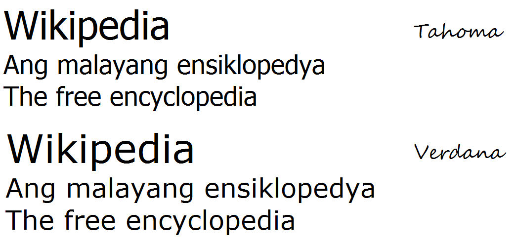
Verdana is a humanist sans-serif typeface designed by Matthew Carter for Microsoft Corporation, with hand- hinting done by Thomas Rickner, then at Monotype. Demand for such a typeface was recognized by Virginia Howlett of Microsoft's typography group and commissioned by Steve Ballmer. The name "Verdana" is derived from " verdant" (green) and "Ana" (the name of Howlett's eldest daughter). Bearing similarities to humanist sans-serif typefaces such as Frutiger, Verdana was designed to be readable at small sizes on the low-resolution computer screens of the period. Like many designs of this type, Verdana has a large x-height (tall lower-case characters), with wider proportions and looser letter-spacing than on print-orientated designs like Helvetica. The counters and apertures are wide, to keep strokes clearly separate from one another, and similarly shaped letters are designed to appear clearly different to increase legibility for body text. The bold weight is thicker than wo ... [...More Info...] [...Related Items...] OR: [Wikipedia] [Google] [Baidu] |
Font Size
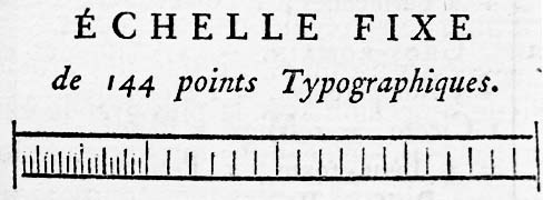
In typography, the point is the smallest unit of measure. It is used for measuring font size, leading, and other items on a printed page. The size of the point has varied throughout printing's history. Since the 18th century, the size of a point has been between 0.18 and 0.4 millimeters. Following the advent of desktop publishing in the 1980s and 1990s, digital printing has largely supplanted the letterpress printing and has established the desktop publishing (DTP) point as the ''de facto'' standard. The DTP point is defined as of an inch (or exactly 0.352 mm) and, as with earlier American point sizes, is considered to be of a pica. In metal type, the point size of a font describes the height of the metal body on which that font's characters were cast. In digital type, letters of a computer font are designed around an imaginary space called an '' em square''. When a point size of a font is specified, the font is scaled so that its em square has a side lengt ... [...More Info...] [...Related Items...] OR: [Wikipedia] [Google] [Baidu] |


