|
Serif Typefaces
This is a list of typefaces, which are separated into groups by distinct artistic differences. The list includes typefaces that have articles or that are referenced. Font superfamily, Superfamilies that fall under more than one category have an asterisk (*) after their name. Serif *Adobe Jenson *Albertus (typeface), Albertus *Aldus (typeface), Aldus *Algerian (virtual typeface), Algerian *Amelia (typeface), Amelia (Designed in 1963 by Stan Davis) *American Typewriter *Antiqua (typeface class), Antiqua *Arno (typeface), Arno* *Aster (typeface), Aster *Aurora (typeface), Aurora and derivatives like ''News 706'' *Baskerville *Bell (typeface), Bell (Didone classification serif type designed by Richard Austin, 1788) *Belwe Roman * Bembo (typeface), Bembo and derivatives like ''Aldine 401'' *Bernhard Modern * Bodoni (typeface family) **Bauer Bodoni *Bitstream Charter *Bookman (typeface), Bookman *Bulmer (typeface), Bulmer *Caledonia (typeface), Caledonia *Calisto MT *Cambria (typefac ... [...More Info...] [...Related Items...] OR: [Wikipedia] [Google] [Baidu] |
Typeface
A typeface (or font family) is a design of Letter (alphabet), letters, Numerical digit, numbers and other symbols, to be used in printing or for electronic display. Most typefaces include variations in size (e.g., 24 point), weight (e.g., light, bold), slope (e.g., italic), width (e.g., condensed), and so on. Each of these variations of the typeface is a font. There are list of typefaces, thousands of different typefaces in existence, with new ones being developed constantly. The art and craft of designing typefaces is called type design. Designers of typefaces are called type designers and are often employed by type foundry, type foundries. In desktop publishing, type designers are sometimes also called "font developers" or "font designers" (a typographer is someone who ''uses'' typefaces to design a page layout). Every typeface is a collection of glyphs, each of which represents an individual letter, number, punctuation mark, or other symbol. The same glyph may be used for ch ... [...More Info...] [...Related Items...] OR: [Wikipedia] [Google] [Baidu] |
Bodoni
Bodoni (, ) is the name given to the serif typefaces first designed by Giambattista Bodoni (1740–1813) in the late eighteenth century and frequently revived since. Bodoni's typefaces are classified as Didone (typography), Didone or modern. Bodoni followed the ideas of John Baskerville, as found in the printing type Baskerville—increased stroke contrast reflecting developing printing technology and a more vertical axis—but he took them to a more extreme conclusion. Bodoni had a long career and his designs changed and varied, ending with a typeface of a slightly condensed underlying structure with flat, unbracketed serifs, extreme contrast between thick and thin strokes, and an overall geometric construction. When first released, Bodoni and other didone fonts were called classical designs because of their rational structure. However, these fonts were not updated versions of Roman or Renaissance letter styles, but new designs. They came to be called 'modern' serif fonts; sinc ... [...More Info...] [...Related Items...] OR: [Wikipedia] [Google] [Baidu] |
Charis SIL
Charis SIL or Charis () is a slab serif typeface developed by SIL International based on Bitstream Charter, one of the first fonts designed for laser printers. The font offers four family members: roman, bold, italic, and bold italic. Its design goal is to "provide a single Unicode-based font family that would contain a comprehensive inventory of glyphs needed for almost any Roman- or Cyrillic-based writing system, whether used for phonetic or orthographic needs." Charis SIL supports Graphite (SIL), Graphite, OpenType, and Apple Advanced Typography, AAT technologies for advanced rendering features. Along with Doulos SIL and Gentium, it is licensed under the SIL Open Font License (OFL), and can be downloaded free of charge. Version 6.2 of the font, with over 3,800 glyphs, was released on 1 February 2023. Version 7 was released on 2 June 2025. Variant forms of many characters can be chosen in the word-processor. For example, for primer (textbook), primer-style 'a' and 'g', app ... [...More Info...] [...Related Items...] OR: [Wikipedia] [Google] [Baidu] |
Century Type Family
Century is a family of serif type faces particularly intended for body text. The family originates from a first design, Century Roman, cut by American Type Founders designer Linn Boyd Benton in 1894 for master printer Theodore Low De Vinne, for use in ''The Century Magazine''. ATF rapidly expanded it into a very large family, first by Linn Boyd, and later by his son Morris. With ATF no longer operating, a wide variety of variants and revivals with varying features and quality are available. Century is based on the "Scotch" genre, a style of type of British origin which had been popular in the United States from the early nineteenth century and is part of the "Didone" genre of type popular through the entire nineteenth century. Its design emphasizes crispness and elegance, with ball terminals, minimalist brackets, prominent slab serifs, and high contrast between thick and thin strokes. Generous whitespace between the letters is intended to offset the weight of the thick strok ... [...More Info...] [...Related Items...] OR: [Wikipedia] [Google] [Baidu] |
Centaur (typeface)
Centaur is a serif typeface by book and typeface designer Bruce Rogers, based on the Renaissance-period printing of Nicolas Jenson around 1470. He used it for his design of the Oxford Lectern Bible. It was given widespread release by the British branch of Monotype, paired with an italic designed by calligrapher Frederic Warde and based on the slightly later work of calligrapher and printer Ludovico Vicentino degli Arrighi. The italic has sometimes been named separately as the "Arrighi" italic. Centaur is an elegant and quite slender design, lighter on the page than Jenson's work and most other revivals, an effect possibly amplified in the digital release compared to the metal type. It has been popular in fine book printing and is often used both for printing body text and especially titles and headings. One of its most notable uses has been in the designs of Penguin Books, who have regularly used it for titling. Historical background Rogers' primary influence was Nicholas Je ... [...More Info...] [...Related Items...] OR: [Wikipedia] [Google] [Baidu] |
Caslon Antique
Caslon Antique is a decorative American typeface that was designed in 1894 by Berne Nadall. It was originally called "Fifteenth Century", but was renamed "Caslon Antique" by Nadall's foundry, Barnhart Bros. & Spindler, in the mid-1920s. The design of the typeface is meant to evoke the Colonial era. Early printers would reuse metal type over and over again, and the faces would become chipped and damaged from use. Caslon Antique emulates this look. Variants An italic variant of the font is also available. In addition to versions available under the traditional name, Corel produces its own version of the font under the name "Casablanca Antique." Notable uses Caslon Antique is popular today when an "old-fashioned" or "gothic" look is desired. It was used in the opening credits of the Jacques Rivette film '' La Belle Noiseuse''. It is used by the musical group The Sisters of Mercy and Sepultura on their albums, for the logo of the musical ''Les Misérables'', and for the cov ... [...More Info...] [...Related Items...] OR: [Wikipedia] [Google] [Baidu] |
Caslon
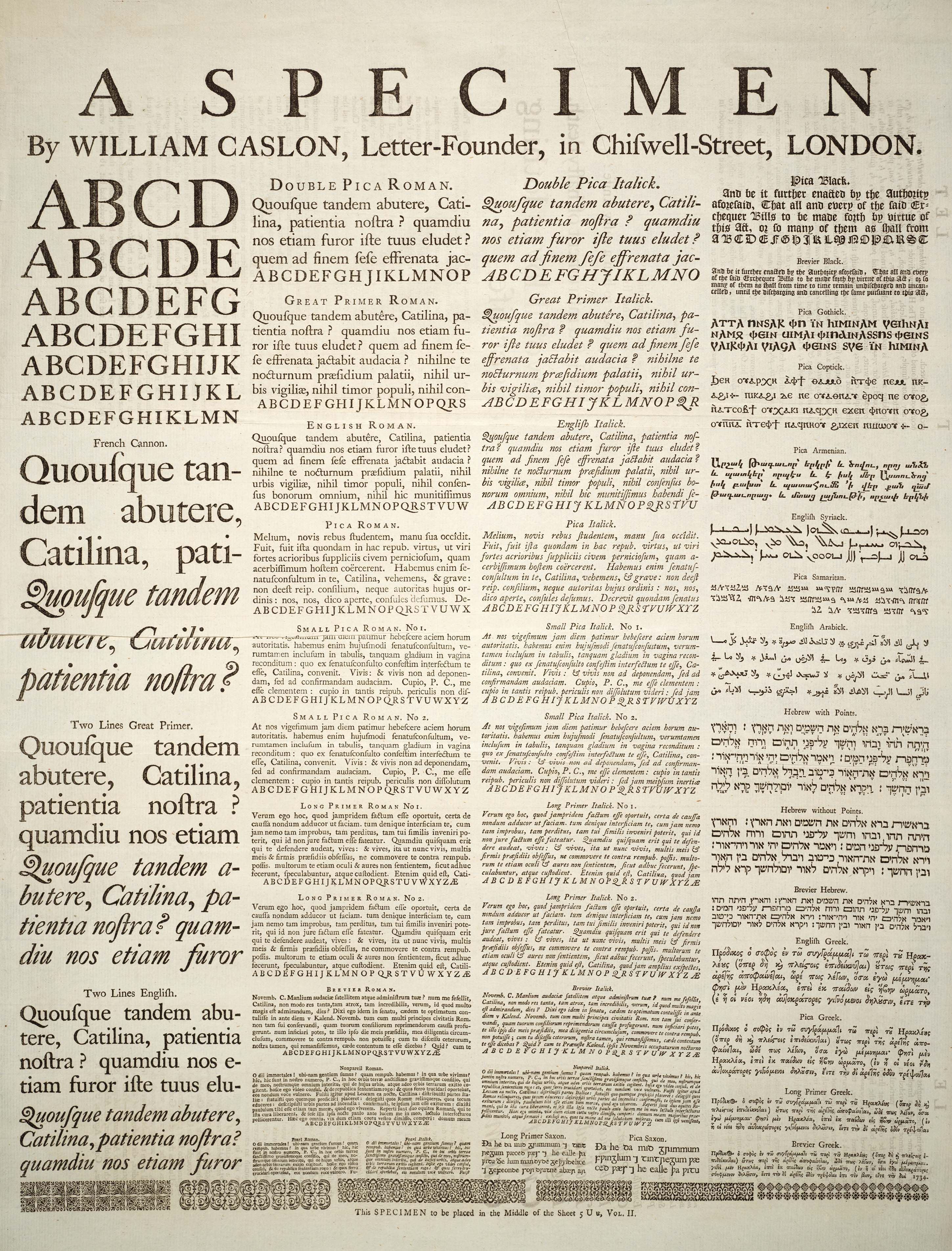
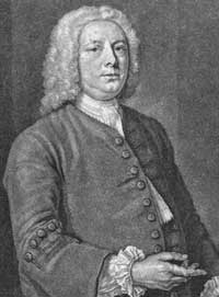
Caslon is the name given to serif typefaces designed by William Caslon, William Caslon I in London, or inspired by his work. Caslon worked as an Engraving, engraver of Punchcutting, punches, the masters used to stamp the moulds or Matrix (printing), matrices used to cast metal type. He worked in the tradition of what is now called Serif#Old-style, old-style serif letter design, that produced letters with a relatively organic structure resembling handwriting with a Quill pen, pen. Caslon established a tradition of engraving type in London, which previously had not been common, and was influenced by the imported Dutch Golden Age, Dutch Baroque typefaces that were popular in England at the time. His typefaces established a strong reputation for their quality and their attractive appearance, suitable for extended passages of text. The letterforms of Caslon's roman type, roman, or upright type include an "A" with a concave hollow at top left and a "G" without a downwards-pointing spur ... [...More Info...] [...Related Items...] OR: [Wikipedia] [Google] [Baidu] |
Cartier (typeface)
Cartier is a family of serif old style typefaces designed in 1967 by Carl Dair, who was commissioned by the Governor General of Canada- in-Council to create a new and distinctively Canadian typeface. The typeface was named for the explorer Jacques Cartier and dedicated to the Canadian people. The first proof of Cartier (in Roman and Italic faces) was published as "the first Canadian type for text composition" to mark the centenary of Canadian Confederation. The typeface was used to set the Canadian Charter of Rights and Freedoms. In 1977 a revival of Cartier was produced under the name ''Raleigh'' by Robert Norton. This typeface was later redesigned by Canadian typographer Typography is the art and technique of Typesetting, arranging type to make written language legibility, legible, readability, readable and beauty, appealing when displayed. The arrangement of type involves selecting typefaces, Point (typogra ... Rod McDonald in a digital format. McDonald's Cartier ... [...More Info...] [...Related Items...] OR: [Wikipedia] [Google] [Baidu] |
Capitals (typeface)
The Appearance Manager is a component of Mac OS 8 and Mac OS 9 that controls the overall look of the Macintosh graphical user interface widgets and supports several themes. It was originally developed for Apple Computer, Apple's ill-fated Copland (operating system), Copland project, but with the cancellation of this project the system was moved into newer versions of the Mac OS. The Appearance Manager is also available free as part of a downloadable Software development kit, SDK for System 7. The Appearance Manager is implemented as an abstraction layer between the Control Manager and QuickDraw. Previously, controls made direct QuickDraw calls to draw user interface elements such as buttons, scrollbars, window title bars, etc. With the Appearance Manager, these elements are abstracted into a series of APIs that draw the item as a distinct entity on behalf of the client code, thus relieving the Control Manager of the task. This extra level of indirection allows the system to supp ... [...More Info...] [...Related Items...] OR: [Wikipedia] [Google] [Baidu] |


