|
Baskerville
Baskerville is a serif typeface designed in the 1750s by John Baskerville (1706–1775) in Birmingham, England, and cut into metal by punchcutter John Handy. Baskerville is classified as a transitional typeface, intended as a refinement of what are now called old-style typefaces of the period, especially those of his most eminent contemporary, William Caslon. Compared to earlier designs popular in Britain, Baskerville increased the contrast between thick and thin strokes, making the serifs sharper and more tapered, and shifted the axis of rounded letters to a more vertical position. The curved strokes are more circular in shape, and the characters became more regular. These changes created a greater consistency in size and form, influenced by the calligraphy Baskerville had learned and taught as a young man. Baskerville's typefaces remain very popular in book design and there are many modern revivals, which often add features such as bold type which did not exist in Baskervill ... [...More Info...] [...Related Items...] OR: [Wikipedia] [Google] [Baidu] |
John Baskerville
John Baskerville (baptised 28 January 1707 – 8 January 1775) was an English businessman, in areas including japanning and papier-mâché, but he is best remembered as a printer and type designer. He was also responsible for inventing "wove paper", which was considerably smoother than "laid paper", allowing for sharper printing results. Life Baskerville was born in the village of Wolverley, near Kidderminster in Worcestershire and baptised on 28 January 1706 OS(1707 NS) at Wolverley church. Baskerville established an early career teaching handwriting and is known to have offered his services cutting gravestones (a demonstration slab by him survives in the Library of Birmingham) before making a considerable fortune from the manufacture of lacquerwork items (japanning). He practised as a printer in Birmingham, England. Baskerville was a member of the Royal Society of Arts, and an associate of some of the members of the Lunar Society. Baskerville directed his pun ... [...More Info...] [...Related Items...] OR: [Wikipedia] [Google] [Baidu] |
Mrs Eaves
Mrs Eaves is a transitional serif typeface designed by Zuzana Licko in 1996. It is a variant of Baskerville, which was designed in Birmingham, England, in the 1750s. Mrs Eaves adapts Baskerville for use in display contexts, such as headings and book blurbs, through the use of a low x-height and a range of unusual combined characters or ligatures. Mrs Eaves was released by Emigre, a type foundry run by Licko and husband Rudy VanderLans, and has been joined by an 'XL' version for body text, as well as Mr Eaves, a sans-serif companion. Description Mrs Eaves is named after Sarah Eaves, the woman who became John Baskerville's wife. Like his typefaces, John Baskerville was, himself, a controversial character. As Baskerville was setting up his printing and type business, he hired Sarah Eaves as his live-in housekeeper; eventually, her husband Richard abandoned her and their five children, and Mrs Eaves became Baskerville's mistress and eventual helpmate with typesetting and prin ... [...More Info...] [...Related Items...] OR: [Wikipedia] [Google] [Baidu] |
Serif
In typography, a serif () is a small line or stroke regularly attached to the end of a larger stroke in a letter or symbol within a particular font or family of fonts. A typeface or "font family" making use of serifs is called a serif typeface (or serifed typeface), and a typeface that does not include them is sans-serif. Some typography sources refer to sans-serif typefaces as "grotesque" (in German, ) or "Gothic", and serif typefaces as "roman". Origins and etymology Serifs originated from the first official Greek writings on stone and in Latin alphabet with inscriptional lettering—words carved into stone in Roman antiquity. The explanation proposed by Father Edward Catich in his 1968 book ''The Origin of the Serif'' is now broadly but not universally accepted: the Roman letter outlines were first painted onto stone, and the stone carvers followed the brush marks, which flared at stroke ends and corners, creating serifs. Another theory is that serifs were devised to neaten ... [...More Info...] [...Related Items...] OR: [Wikipedia] [Google] [Baidu] |
Giambattista Bodoni
Giambattista Bodoni (, ; 16 February 1740 – 30 November 1813) was an Italian typographer, type-designer, compositor, printer, and publisher in Parma. He first took the type-designs of Pierre Simon Fournier as his exemplars, but afterwards became an admirer of the more modelled types of John Baskerville; and he and Firmin Didot evolved a style of type called "Modern", in which the letters are cut in such a way as to produce a strong contrast between the thick and thin parts of their body. Bodoni designed many typefaces, each one in a large range of type sizes. He is even more admired as a compositor than as a type designer, as the large range of sizes which he cut enabled him to compose his pages with the greatest possible subtlety of spacing. Like Baskerville, he sets off his texts with wide margins and uses little or no illustrations or decorations. Bodoni achieved an unprecedented level of technical refinement, allowing him to faithfully reproduce letterforms with very thin ... [...More Info...] [...Related Items...] OR: [Wikipedia] [Google] [Baidu] |
Serif
In typography, a serif () is a small line or stroke regularly attached to the end of a larger stroke in a letter or symbol within a particular font or family of fonts. A typeface or "font family" making use of serifs is called a serif typeface (or serifed typeface), and a typeface that does not include them is sans-serif. Some typography sources refer to sans-serif typefaces as "grotesque" (in German, ) or "Gothic", and serif typefaces as "roman". Origins and etymology Serifs originated from the first official Greek writings on stone and in Latin alphabet with inscriptional lettering—words carved into stone in Roman antiquity. The explanation proposed by Father Edward Catich in his 1968 book ''The Origin of the Serif'' is now broadly but not universally accepted: the Roman letter outlines were first painted onto stone, and the stone carvers followed the brush marks, which flared at stroke ends and corners, creating serifs. Another theory is that serifs were devised to neaten ... [...More Info...] [...Related Items...] OR: [Wikipedia] [Google] [Baidu] |
Joan Michaël Fleischman
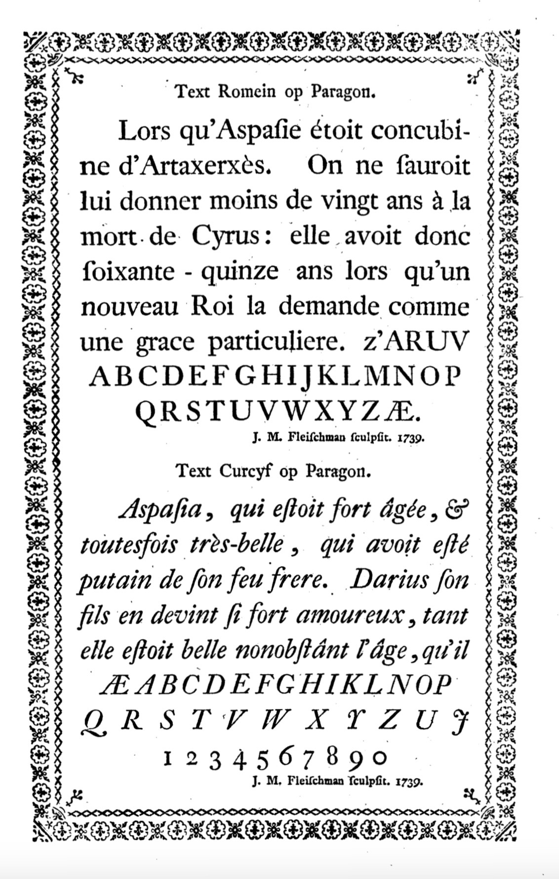
Joan Michaël Fleischman (1707–27 May 1768, german: Johann Michael Fleischmann), was an 18th-century German-Dutch typographer and punchcutter. Fleischman worked in the Baroque period of design and his roman typefaces have been described as "transitional" in style, more stylised and sharply cut than was common before. Perhaps his most notable design was his complex music font, that was later used to decorate the edges of documents, including the first bank note of the Netherlands called the "roodborstje" or robin. Biography He was born in Wöhrd, Nuremberg, but moved to Amsterdam, where he worked for Izaak van der Putte and Hermanus Uytwerff before opening his own type foundry in 1735. Fleischman was unable to continue the type foundry on his own, and Rudolf Wetstein ran the business for him, while he continued to work for him as a punchcutter. After Rudolf died in 1742, his son Hendrik Joris Wetstein sold the company in 1743 to Izaak Enschedé of Haarlem, forming the nu ... [...More Info...] [...Related Items...] OR: [Wikipedia] [Google] [Baidu] |
Italic Type
In typography, italic type is a cursive font based on a stylised form of calligraphic handwriting. Owing to the influence from calligraphy, italics normally slant slightly to the right. Italics are a way to emphasise key points in a printed text, to identify many types of creative works, to cite foreign words or phrases, or, when quoting a speaker, a way to show which words they stressed. One manual of English usage described italics as "the print equivalent of underlining"; in other words, underscore in a manuscript directs a typesetter to use italic. The name comes from the fact that calligraphy-inspired typefaces were first designed in Italy, to replace documents traditionally written in a handwriting style called chancery hand. Aldus Manutius and Ludovico Arrighi (both between the 15th and 16th centuries) were the main type designers involved in this process at the time. Along with blackletter and Roman type, it served as one of the major typefaces in the history of ... [...More Info...] [...Related Items...] OR: [Wikipedia] [Google] [Baidu] |
Cambridge University Press
Cambridge University Press is the university press of the University of Cambridge. Granted letters patent by King Henry VIII in 1534, it is the oldest university press in the world. It is also the King's Printer. Cambridge University Press is a department of the University of Cambridge and is both an academic and educational publisher. It became part of Cambridge University Press & Assessment, following a merger with Cambridge Assessment in 2021. With a global sales presence, publishing hubs, and offices in more than 40 countries, it publishes over 50,000 titles by authors from over 100 countries. Its publishing includes more than 380 academic journals, monographs, reference works, school and university textbooks, and English language teaching and learning publications. It also publishes Bibles, runs a bookshop in Cambridge, sells through Amazon, and has a conference venues business in Cambridge at the Pitt Building and the Sir Geoffrey Cass Sports and Social Centre. ... [...More Info...] [...Related Items...] OR: [Wikipedia] [Google] [Baidu] |
Pierre Simon Fournier
Pierre-Simon Fournier (15 September 1712 – 8 October 1768) was a French mid-18th century punch-cutter, typefounder and typographic theoretician. He was both a collector and originator of types. Fournier's contributions to printing were his creation of initials and ornaments, his design of letters, and his standardization of type sizes. He worked in the rococo form, and designed typefaces including Fournier and Narcissus. He was known for incorporating ‘decorative typographic ornaments’ into his typefaces. Fournier's main accomplishment is that he ‘created a standardized measuring system that would revolutionize the typography industry forever’. He was also known as Fournier le Jeune ("the younger") to distinguish him from his father Jean Claude, who was also in the typesetting industry. In his early life, Fournier studied watercolour with J. B. G. Colson, and later wood engraving. In 1737, Fournier published his first theoretical work, on the minimum spacing between l ... [...More Info...] [...Related Items...] OR: [Wikipedia] [Google] [Baidu] |
Birmingham
Birmingham ( ) is a city and metropolitan borough in the metropolitan county of West Midlands in England. It is the second-largest city in the United Kingdom with a population of 1.145 million in the city proper, 2.92 million in the West Midlands metropolitan county, and approximately 4.3 million in the wider metropolitan area. It is the largest UK metropolitan area outside of London. Birmingham is known as the second city of the United Kingdom. Located in the West Midlands region of England, approximately from London, Birmingham is considered to be the social, cultural, financial and commercial centre of the Midlands. Distinctively, Birmingham only has small rivers flowing through it, mainly the River Tame and its tributaries River Rea and River Cole – one of the closest main rivers is the Severn, approximately west of the city centre. Historically a market town in Warwickshire in the medieval period, Birmingham grew during the 18th century during the Mi ... [...More Info...] [...Related Items...] OR: [Wikipedia] [Google] [Baidu] |
Typeface
A typeface (or font family) is the design of lettering that can include variations in size, weight (e.g. bold), slope (e.g. italic), width (e.g. condensed), and so on. Each of these variations of the typeface is a font. There are thousands of different typefaces in existence, with new ones being developed constantly. The art and craft of designing typefaces is called ''type design''. Designers of typefaces are called ''type designers'' and are often employed by ''type foundries''. In desktop publishing, type designers are sometimes also called ''font developers'' or ''font designers''. Every typeface is a collection of glyphs, each of which represents an individual letter, number, punctuation mark, or other symbol. The same glyph may be used for characters from different scripts, e.g. Roman uppercase A looks the same as Cyrillic uppercase А and Greek uppercase alpha. There are typefaces tailored for special applications, such as cartography, astrology or mathematics. Te ... [...More Info...] [...Related Items...] OR: [Wikipedia] [Google] [Baidu] |
William Caslon
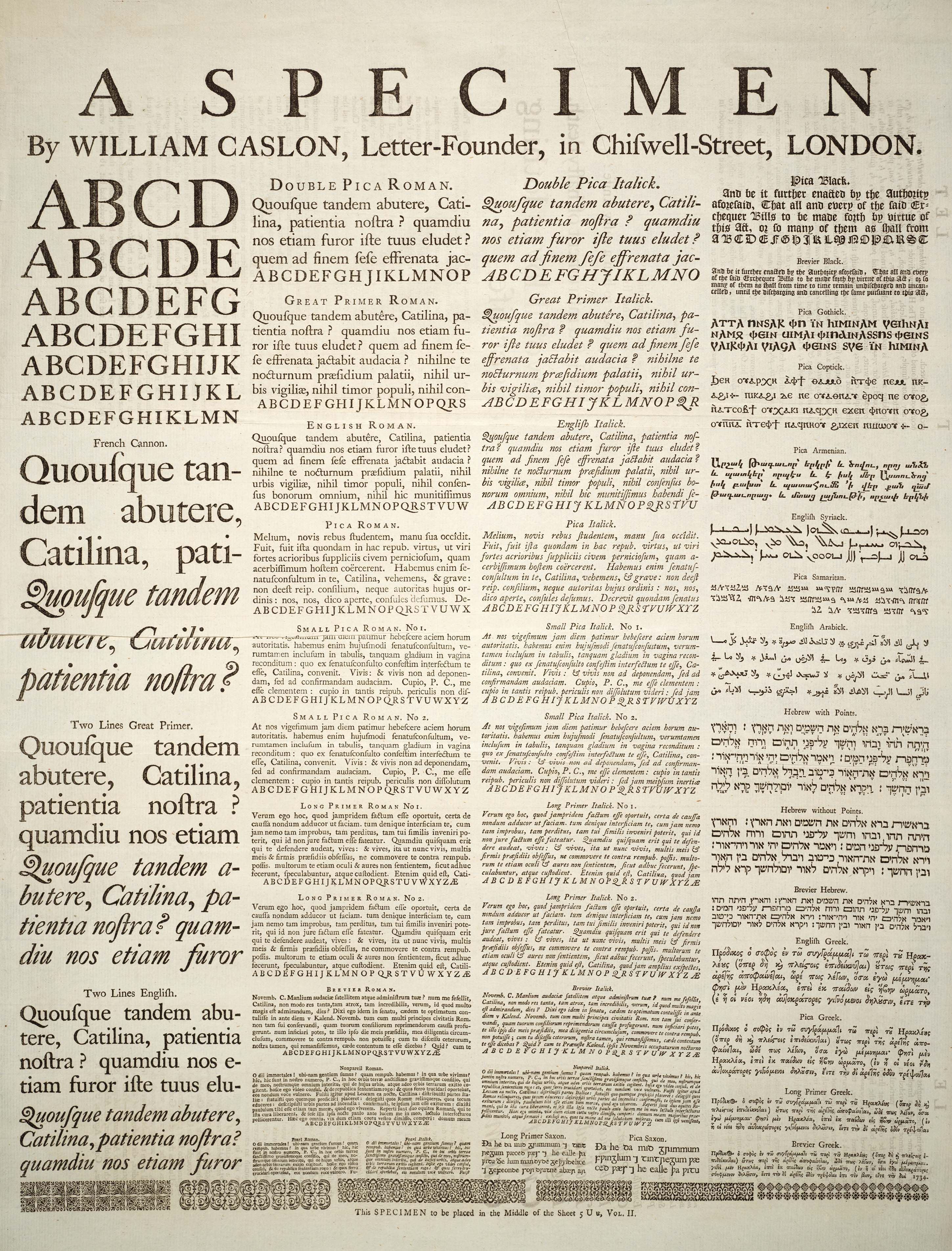
William Caslon I (1692/1693 – 23 January 1766), also known as William Caslon the Elder,Oxford Dictionary of National Biography was an English typefounder. The distinction and legibility of his type secured him the patronage of the leading printers of the day in England and on the continent. His typefaces transformed English type design and first established an English national typographic style. Luna, 2013, p. 515-516 Life Caslon was born in Cradley, Worcestershire in 1692 or 1693 and trained as an engraver in nearby Birmingham. In 1716, he started business in London as an engraver of gun locks and barrels and as a bookbinder's tool cutter. Having contact with printers, he was induced to fit up a type foundry, largely through the encouragement of William Bowyer. He died on 23 January 1766, and was buried in the churchyard of St Luke Old Street, London, where the family tomb is preserved (bearing his name and others). Typefaces Though his name would come to be identi ... [...More Info...] [...Related Items...] OR: [Wikipedia] [Google] [Baidu] |


