Ascender (typography) on:
[Wikipedia]
[Google]
[Amazon]
 In
In  In many fonts intended for body text, such as Bembo and
 In
In typography
Typography is the art and technique of Typesetting, arranging type to make written language legibility, legible, readability, readable and beauty, appealing when displayed. The arrangement of type involves selecting typefaces, Point (typogra ...
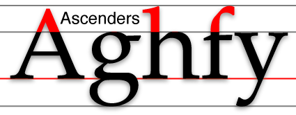
and handwriting, an ascender is the portion of a minuscule
Letter case is the distinction between the letters that are in larger uppercase or capitals (more formally ''majuscule'') and smaller lowercase (more formally '' minuscule'') in the written representation of certain languages. The writing system ...
letter in a Latin-derived alphabet that extends above the mean line of a font
In metal typesetting, a font is a particular size, weight and style of a ''typeface'', defined as the set of fonts that share an overall design.
For instance, the typeface Bauer Bodoni (shown in the figure) includes fonts " Roman" (or "regul ...
. That is, the part of a lower-case letter that is taller than the font's x-height.
Ascenders, together with descenders, increase the recognizability of words. For this reason, many situations that require high legibility such as road signs avoid using solely capital letters
Letter case is the distinction between the letters that are in larger uppercase or capitals (more formally ''#Majuscule, majuscule'') and smaller lowercase (more formally ''#Minuscule, minuscule'') in the written representation of certain langua ...
(i.e. all-caps).
Studies made at the start of the construction of the British motorway network concluded that words with mixed-case letters were much easier to read than "all-caps" and a special font was designed for motorway signs. These then became universal across the UK. See Road signs in the United Kingdom.
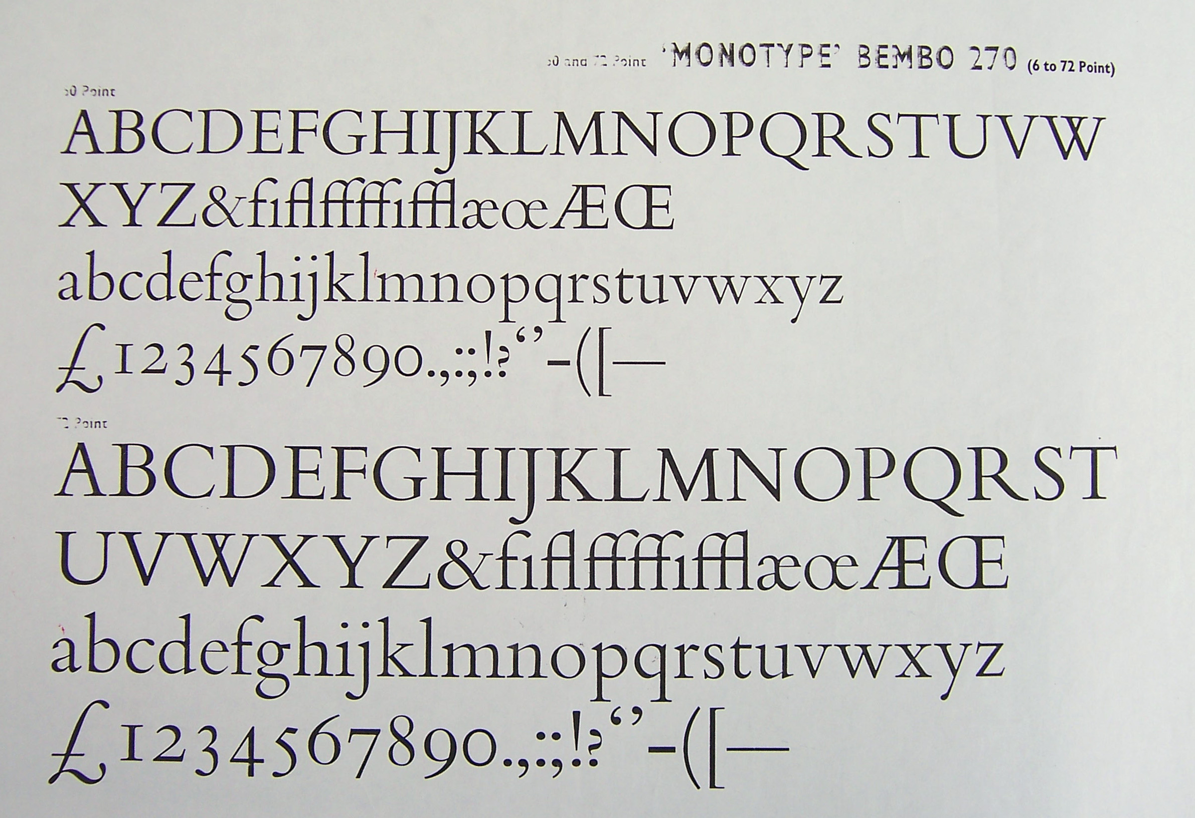
 In many fonts intended for body text, such as Bembo and
 Garamond
Garamond is a group of many serif typefaces, named for sixteenth-century Parisian engraver Claude Garamond, generally spelled as Garamont in his lifetime. Garamond-style typefaces are popular to this day and often used for book printing and bod ...
, ascenders rise above the cap height
In typography, cap height is the height of a capital letter above the baseline for a particular typeface
A typeface (or font family) is a design of Letter (alphabet), letters, Numerical digit, numbers and other symbols, to be used in printing ...
of the capital letters.
References
{{Typography terms Typography