|
Choropleth
A choropleth map () is a type of statistical thematic map that uses pseudocolor, meaning color corresponding with an aggregate summary of a geographic characteristic within spatial enumeration units, such as population density or per-capita income. Choropleth maps provide an easy way to visualize how a variable varies across a geographic area or show the level of variability within a region. A heat map or isarithmic map is similar but uses regions drawn according to the pattern of the variable, rather than the ''a priori'' geographic areas of choropleth maps. The choropleth is likely the most common type of thematic map because published statistical data (from government or other sources) is generally aggregated into well-known geographic units, such as countries, states, provinces, and counties, and thus they are relatively easy to create using Geographic information system, GIS, spreadsheets, or other software tools. History The earliest known choropleth map was created i ... [...More Info...] [...Related Items...] OR: [Wikipedia] [Google] [Baidu] |
Dasymetric Map
A dasymetric map () is a type of thematic map that uses areal symbols to visualize a geographic field by refining a choropleth map with ancillary information about the distribution of the variable. The name refers to the fact that the most common variable mapped using this technique has generally been population density. The dasymetric map is a hybrid product combining the strengths and weaknesses of choropleth and isarithmic maps.T. Slocum, R. McMaster, F. Kessler, H. Howard (2009). Thematic Cartography and Geovisualization, Third Edn, page 252. Pearson Prentice Hall: Upper Saddle River, NJ. Dasymetric maps are used instead of choropleth maps because they represent underlying data distributions more accurately. Choropleth maps and dasymetric maps differ in three main ways. First, dasymetric zones are generated using ancillary data while boundaries on choropleth maps use units used for more general purposes (such as U.S. county boundaries). Second, choropleth zones have vary ... [...More Info...] [...Related Items...] OR: [Wikipedia] [Google] [Baidu] |
Thematic Map
A thematic map is a type of map that portrays the geographic pattern of a particular subject matter (theme) in a geographic area. This usually involves the use of map symbols to Geovisualization, visualize selected properties of geographic features that are not naturally visible, such as temperature, language, or population. In this, they contrast with general reference maps, which focus on the location (more than the properties) of a diverse set of physical features, such as rivers, roads, and buildings. Alternative names have been suggested for this class, such as ''special-subject'' or ''special-purpose maps'', ''statistical maps'', or ''distribution maps'', but these have generally fallen out of common usage. Thematic mapping is closely allied with the field of Geovisualization. Several types of thematic maps have been invented, starting in the 18th and 19th centuries, as large amounts of statistical data began to be collected and published, such as Census, national census ... [...More Info...] [...Related Items...] OR: [Wikipedia] [Google] [Baidu] |
Heat Map
A heat map (or heatmap) is a 2-dimensional data visualization technique that represents the magnitude of individual values within a dataset as a color. The variation in color may be by hue or intensity. In some applications such as crime analytics or website click-tracking, color is used to represent the ''density'' of data points rather than a value associated with each point. "Heat map" is a relatively new term, but the practice of shading matrices has existed for over a century. History Heat maps originated in 2D displays of the values in a data matrix. Larger values were represented by small dark gray or black squares (pixels) and smaller values by lighter squares. The earliest known example dates to 1873, when Toussaint Loua used a hand-drawn and colored shaded matrix to visualize social statistics across the districts of Paris. The idea of reordering rows and columns to reveal structure in a data matrix, known as seriation, was introduced by Flinders Petrie in 1899. ... [...More Info...] [...Related Items...] OR: [Wikipedia] [Google] [Baidu] |
Pseudocolor
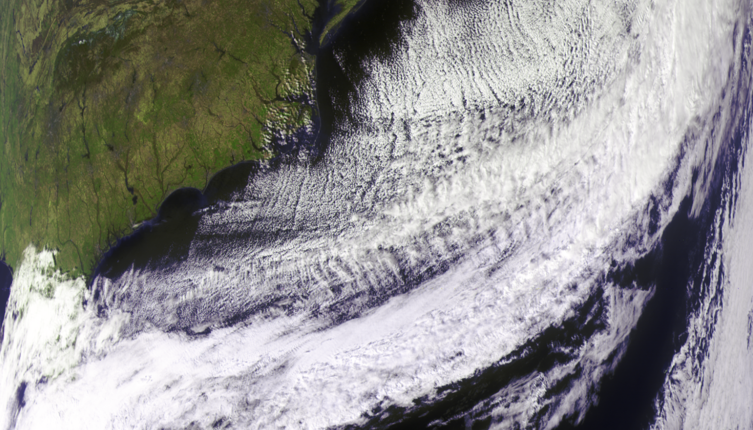
False colors and pseudo colors respectively refers to a group of color rendering methods used to display images in colors which were recorded in the visible or non-visible parts of the electromagnetic spectrum. A false-color image is an image that depicts an object in colors that differ from those a photograph (a true-color image) would show. In this image, colors have been assigned to three different wavelengths that human eyes cannot normally see. In addition, variants of ''false colors'' such as pseudocolors, density slicing, and choropleths are used for information visualization of either data gathered by a single grayscale channel or data not depicting parts of the electromagnetic spectrum (e.g. elevation in relief maps or tissue types in magnetic resonance imaging). Types of color renderings True color The concept behind true color can help in understanding false color. An image is called a ''true-color'' image when it offers a natural color rendition, or when i ... [...More Info...] [...Related Items...] OR: [Wikipedia] [Google] [Baidu] |
Charles Dupin
Baron Pierre Charles François Dupin (; 6 October 1784, Varzy, Nièvre – 18 January 1873, Paris, France) was a French Catholic mathematician, engineer, economist and politician, particularly known for work in the field of mathematics, where the Dupin cyclide and Dupin indicatrix are named after him; and for his work in the field of statistical and thematic mapping. Palsky, Gilles.Connections and Exchanges in European Thematic Cartography. The case of XIXth century choropleth maps" ''Formatting Europe. Mapping a continent.'' 2007 In 1826 he created the earliest known choropleth map. Michael Friendly (2008)"Milestones in the history of thematic cartography, statistical graphics, and data visualization" Life and work He was born in Varzy in France, the son of Charles Andre Dupin, a lawyer, and Catherine Agnes Dupin. His elder brother is André Marie Jean Jacques Dupin. Dupin studied geometry with Monge at the École Polytechnique and then became a naval engineer ( ENSTA). ... [...More Info...] [...Related Items...] OR: [Wikipedia] [Google] [Baidu] |
Chorochromatic Map
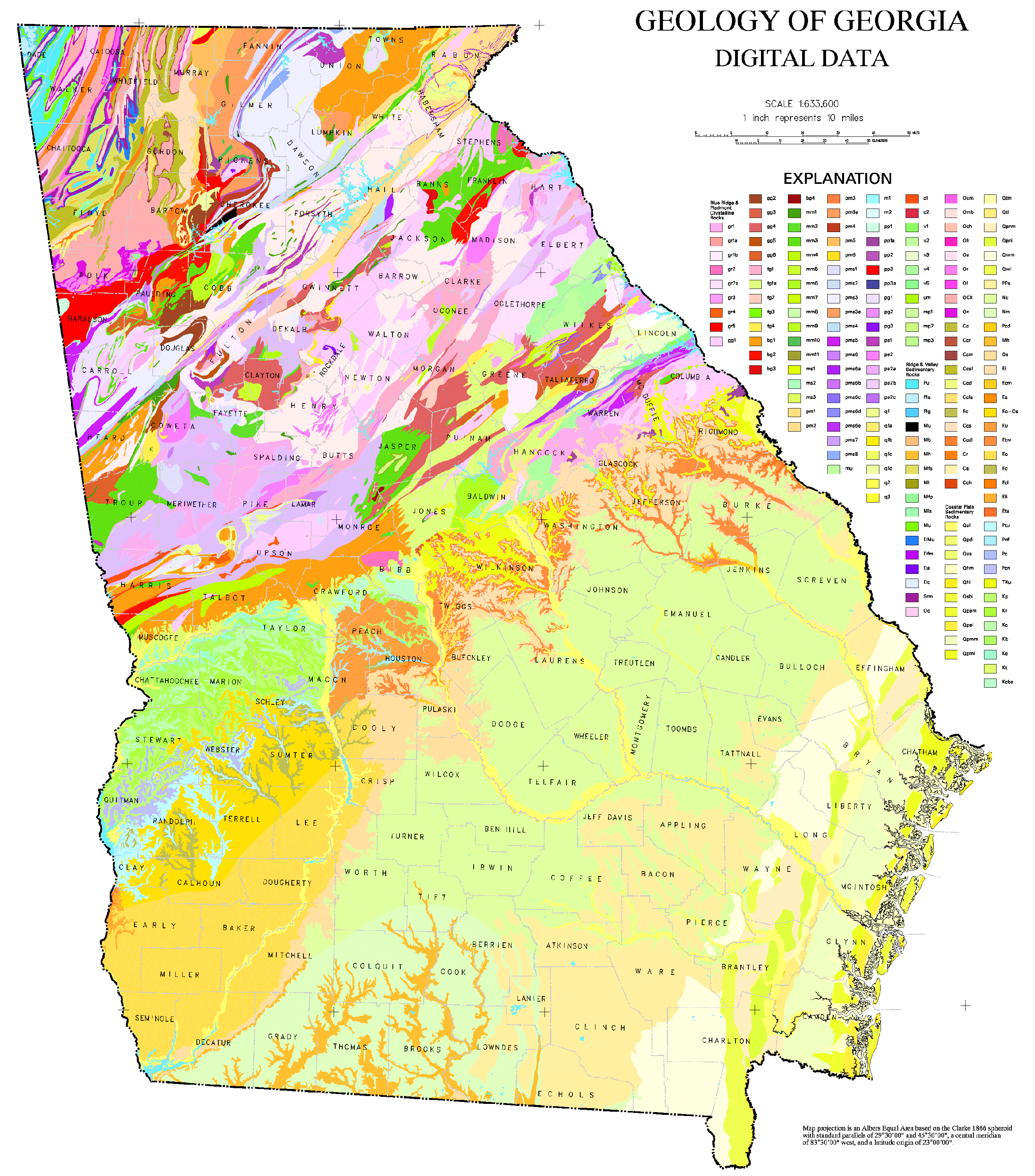
A Chorochromatic map (), also known as an area-class, Qualitative data, qualitative area, or mosaic map, is a type of thematic map that portray regions of categorical or nominal data using variations in color Map symbol, symbols. Chorochromatic maps are typically used to represent discrete Field (geography), fields, also known as categorical coverages. Chorochromatic maps differ from choropleth maps in that chorochromatic maps are mapped according to data-driven boundaries instead of trying to make the data fit within existing, sometimes arbitrary units such as Border, political boundaries. History The chorochromatic map is one of the oldest types of thematic map, first appearing independently in several different fields. In 1741, Gottfried Hensel published ''Synopsis Universae Philologiae'', a book about world languages that included a set of maps of language regions, each with boundaries and colors for broad Language family, language families as he understood them. Other map ... [...More Info...] [...Related Items...] OR: [Wikipedia] [Google] [Baidu] |
John Kirtland Wright
John Kirtland Wright (1891–1969) was an American geographer, notable for his cartography, geosophy, and study of the history of geographical thought. He was the son of classical scholar John Henry Wright and novelist Mary Tappan Wright, and the brother of legal scholar and utopian novelist Austin Tappan Wright. He married Katharine McGiffert Jan. 21, 1921 in New York, N.Y. They had three children: Austin McGiffert Wright, Gertrude Huntington McPherson, and Mary Wolcott Toynbee. Having completed a PhD in history at Harvard University, in 1920 Wright was employed as librarian by the American Geographical Society; between the years of 1920 and 1956 he also served as an AGS editor, personal academic contributor, and eventually director. As a result of his prolific academic and professional life, three main themes have emerged in John K. Wright’s published works. These include: the overlapping of academic disciplines (mainly history) with geography, the power of the mind and t ... [...More Info...] [...Related Items...] OR: [Wikipedia] [Google] [Baidu] |
Modifiable Areal Unit Problem
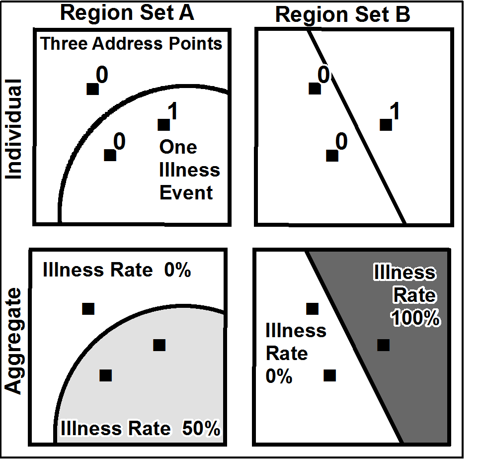
__NOTOC__ The modifiable areal unit problem (MAUP) is a source of statistical bias that can significantly impact the results of statistical hypothesis tests. MAUP affects results when point-based measures of spatial phenomena are Aggregate data, aggregated into spatial partitions or ''areal units'' (such as regions or districts) as in, for example, population density or illness rates. The resulting summary values (e.g., totals, rates, proportions, densities) are influenced by both the shape and Scale (geography), scale of the aggregation unit. For example, census data may be aggregated into county districts, census tracts, postcode areas, police precincts, or any other arbitrary spatial partition. Thus the results of data aggregation are dependent on the mapmaker's choice of which "modifiable areal unit" to use in their analysis. A census choropleth map calculating population density using state boundaries will yield radically different results from a map that calculates density ba ... [...More Info...] [...Related Items...] OR: [Wikipedia] [Google] [Baidu] |
Mark Monmonier
Mark Stephen Monmonier (born February 2, 1943) is a Distinguished Professor of Geography and the Environment at the Maxwell School of Citizenship and Public Affairs of Syracuse University. He specializes in geography, geographic information systems, toponymy, and the history of cartography. Early life Monmonier was born in Baltimore, Maryland to parents John Carroll Monmonier and Martha Monmonier. His father worked for the Baltimore and Ohio Railroad, and his mother worked as an elementary school teacher, teaching 5th grade. His father's career enabled their family to travel via rail through the use of his employee pass, and Monmonier noted he was exposed to several Transit maps and developed an early interest in rail transportation. Monmonier attended Calvert Hall College High School, and spent time at the Enoch Pratt Free Library where he attended lectures and was exposed to the Maryland Geological Survey reports, which contributed to an interest in geology and networks. Edu ... [...More Info...] [...Related Items...] OR: [Wikipedia] [Google] [Baidu] |
Contour Line
A contour line (also isoline, isopleth, isoquant or isarithm) of a Function of several real variables, function of two variables is a curve along which the function has a constant value, so that the curve joins points of equal value. It is a cross-section (geometry)#Definition, plane section of the graph of a function of two variables, three-dimensional graph of the function f(x,y) parallel to the (x,y)-plane. More generally, a contour line for a function of two variables is a curve connecting points where the function has the same particular value. In cartography, a contour line (often just called a "contour") joins points of equal elevation (height) above a given level, such as mean sea level. A contour map is a map illustrated with contour lines, for example a topographic map, which thus shows valleys and hills, and the steepness or gentleness of slopes. The contour interval of a contour map is the difference in elevation between successive contour lines. The gradient of t ... [...More Info...] [...Related Items...] OR: [Wikipedia] [Google] [Baidu] |
Isarithmic Map
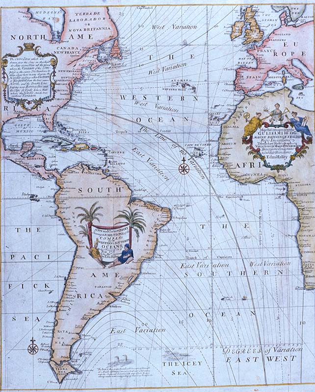
A contour line (also isoline, isopleth, isoquant or isarithm) of a function of two variables is a curve along which the function has a constant value, so that the curve joins points of equal value. It is a plane section of the three-dimensional graph of the function f(x,y) parallel to the (x,y)-plane. More generally, a contour line for a function of two variables is a curve connecting points where the function has the same particular value. In cartography, a contour line (often just called a "contour") joins points of equal elevation (height) above a given level, such as mean sea level. A contour map is a map illustrated with contour lines, for example a topographic map, which thus shows valleys and hills, and the steepness or gentleness of slopes. The contour interval of a contour map is the difference in elevation between successive contour lines. The gradient of the function is always perpendicular to the contour lines. When the lines are close together the magnitude of ... [...More Info...] [...Related Items...] OR: [Wikipedia] [Google] [Baidu] |


