|
Font Size
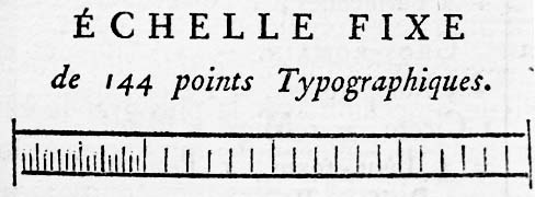
In typography, the point is the smallest unit of measure. It is used for measuring font size, leading, and other items on a printed page. The size of the point has varied throughout printing's history. Since the 18th century, the size of a point has been between 0.18 and 0.4 millimeters. Following the advent of desktop publishing in the 1980s and 1990s, digital printing has largely supplanted the letterpress printing and has established the desktop publishing (DTP) point as the ''de facto'' standard. The DTP point is defined as of an inch (or exactly 0.352 mm) and, as with earlier American point sizes, is considered to be of a pica. In metal type, the point size of a font describes the height of the metal body on which that font's characters were cast. In digital type, letters of a computer font are designed around an imaginary space called an '' em square''. When a point size of a font is specified, the font is scaled so that its em square has a side lengt ... [...More Info...] [...Related Items...] OR: [Wikipedia] [Google] [Baidu] |
Inch
The inch (symbol: in or prime (symbol), ) is a Units of measurement, unit of length in the imperial units, British Imperial and the United States customary units, United States customary System of measurement, systems of measurement. It is equal to yard or of a foot (unit), foot. Derived from the Uncia (unit), Roman uncia ("twelfth"), the word ''inch'' is also sometimes used to translate similar units in other measurement systems, anthropic units, usually understood as deriving from the width of the human thumb. Standards for the exact length of an inch have varied in the past, but since the adoption of the international yard during the 1950s and 1960s the inch has been based on the metric system and defined as exactly 25.4Millimetre, mm. Name The English word "inch" () was an early borrowing from Latin ' ("one-twelfth; Roman inch; Roman ounce"). The vowel change from Latin to Old English (which became Modern English ) is known as Germanic umlaut, umlaut. The consonant c ... [...More Info...] [...Related Items...] OR: [Wikipedia] [Google] [Baidu] |
Body Height (typography)
In typography, the body height or point size refers to the height of the space in which a glyph is defined. Originally, in metal typesetting, the body height or the font (or point) size was defined by the height of the lead cuboid ( metal sort) on which the actual font face is moulded. The body height of a metal sort defined the point size, and was usually slightly larger than the distance between the ascender and descender to allow additional space between the lines of text. More space might be achieved by inserting thin long pieces of lead between the lines of text (that is ''leading''). In digital fonts, the body is now a virtual, imaginary area, whose height still equals the point size as it did in metal type. The distance between one baseline and the next is the sum of the body height and the leading, often expressed as "characters per inch vertically" (as in ) or lines of text per inch (not to be confused with lines per inch, a measure of printed photograph resoluti ... [...More Info...] [...Related Items...] OR: [Wikipedia] [Google] [Baidu] |
Pied Du Roi
The traditional French units of measurement prior to metrication were established under Charlemagne during the Carolingian Renaissance. Based on contemporary Byzantine and ancient Roman measures, the system established some consistency across his empire but, after his death, the empire fragmented and subsequent rulers and various localities introduced their own variants. Some of Charlemagne's units, such as the king's foot () remained virtually unchanged for about a thousand years, while others important to commercesuch as the French ell () used for cloth and the French pound () used for amountsvaried dramatically from locality to locality. By the 18th century, the number of units of measure had grown to the extent that it was almost impossible to keep track of them and one of the major legacies of the French Revolution was the dramatic rationalization of measures as the new metric system. The change was extremely unpopular, however, and a metricized version of the traditional ... [...More Info...] [...Related Items...] OR: [Wikipedia] [Google] [Baidu] |
Units Of Measurement In France Before The French Revolution
The traditional French units of measurement prior to metrication were established under Charlemagne during the Carolingian Renaissance. Based on contemporary Byzantine units of measurement, Byzantine and Ancient Roman units of measurement, ancient Roman measures, the system established some consistency across Carolingian Empire, his empire but, after his death, the empire fragmented and subsequent rulers and various localities introduced their own variants. Some of Charlemagne's units, such as the king's foot () remained virtually unchanged for about a thousand years, while others important to commercesuch as the French ell () used for cloth and the French pound () used for amountsvaried dramatically from locality to locality. By the 18th century, the number of units of measure had grown to the extent that it was almost impossible to keep track of them and one of the major legacies of the French Revolution was the dramatic rationalization of measures as the new metric system. The ... [...More Info...] [...Related Items...] OR: [Wikipedia] [Google] [Baidu] |
Units Of Measurement In France
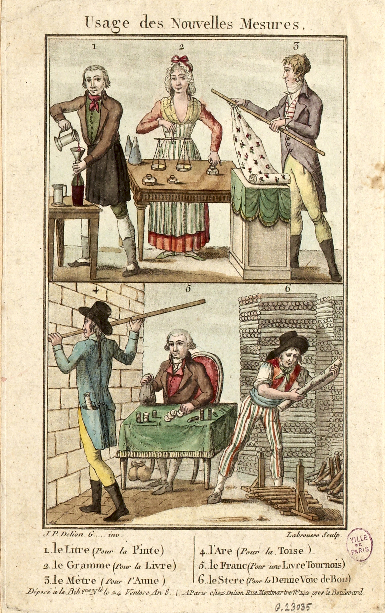
200px, Table of the measuring units used in the 17th century at region of southeastern France France has a unique history of Unit of measurement, units of measurement due to its radical decision to invent and adopt the metric system after the French Revolution. In the Ancien régime and until 1795, France used a system of measures that had many of the characteristics of the modern Imperial System of units but with no unified system. There was widespread abuse of the king's standards, to the extent that the ''lieue'' could vary from 3.268 km in Beauce to 5.849 km in Provence. During the revolutionary era and motivated in part by the inhomogeneity of the old system, France switched to the first version of the metric system. This system was not well received by the public, and between 1812 and 1837, the country used the '' mesures usuelles'' – traditional names were restored, but the corresponding quantities were based on metric units: for example, the ''livre'' (pou ... [...More Info...] [...Related Items...] OR: [Wikipedia] [Google] [Baidu] |
World Wide Web Consortium
The World Wide Web Consortium (W3C) is the main international standards organization for the World Wide Web. Founded in 1994 by Tim Berners-Lee, the consortium is made up of member organizations that maintain full-time staff working together in the development of standards for the World Wide Web. W3C has 350 members. The organization has been led by CEO Seth Dobbs since October 2023. W3C also engages in education and outreach, develops software and serves as an open forum for discussion about the Web. History The World Wide Web Consortium (W3C) was founded in 1994 by Tim Berners-Lee after he left the European Organization for Nuclear Research (CERN) in October 1994. It was founded at the Massachusetts Institute of Technology (MIT) Laboratory for Computer Science with support from the European Commission, and the Defense Advanced Research Projects Agency, which had pioneered the ARPANET, the most direct predecessor to the modern Internet. It was located in Technology Square (Ca ... [...More Info...] [...Related Items...] OR: [Wikipedia] [Google] [Baidu] |
Typeface Anatomy
Typeface anatomy describes the graphic elements that make up letters in a typeface. Strokes The ''strokes'' are the components of a letterform. Strokes may be ''straight'', as in , or ''curved'', as in . If straight, they may be ''horizontal, vertical,'' or ''diagonal''; if curved, ''open'' or ''closed''. Typographers also speak of an ''instroke,'' where one starts writing the letter, as at the top of , and an ''outstroke,'' where the pen leaves off, as at the bottom of . A main vertical stroke is a ''stem''. The letter has three, the left, middle, and right stems. The central stroke of an is known as the ''spine''. When the stroke is part of a Letter case, lowercase and rises above the height of an (the x height), it is known as an ''Ascender (typography), ascender''. Letters with ascenders are . A stroke which drops below the baseline (typography), baseline is a ''descender''. Letters with descenders are . An arching stroke is a ''shoulder'' as in the top of an or s ... [...More Info...] [...Related Items...] OR: [Wikipedia] [Google] [Baidu] |
Francesco Torniello
Francesco Torniello da Novara (c. 1490 – 1589) was a Milanese typographer, writer and Franciscan friar who became known for applying geometric specifications to Latin capital letters fonts. Life Torniello was born between 1488 and 1491 in Barengo, which was part of the Duchy of Milan. He came from a noble family of the area. He studied geometry and mathematics. In 1519 he joined the Order of Friars Minor as a preacher. In 1525 Torniello and his brother, Giovanni Antonio gained Milanese citizenship. He died in 1589 in the monastery of Treviglio in the Duchy of Milan. Works Torniello's works were focused on adopting the Latin alphabet inscriptions as original as possible, while simultaneously improving their geometric conditions. His works were influenced by Luca Pacioli's ''Divine Proportione'' (''Divine Proportions'') and Sigismondo Fanti. These fonts were not then designed for usage in the printing press, but as a model for artistic inscriptions. Torniello designed a ... [...More Info...] [...Related Items...] OR: [Wikipedia] [Google] [Baidu] |
Typographer
Typography is the art and technique of Typesetting, arranging type to make written language legibility, legible, readability, readable and beauty, appealing when displayed. The arrangement of type involves selecting typefaces, Point (typography), point sizes, line lengths, line spacing, letter spacing, and Kerning, spaces between pairs of letters. The term ''typography'' is also applied to the style, arrangement, and appearance of the letters, numbers, and symbols created by the process. Type design is a closely related craft, sometimes considered part of typography; most typographers do not design typefaces, and some type designers do not consider themselves typographers. Typography also may be used as an ornamental and decorative device, unrelated to the communication of information. Typography is also the work of graphic designers, art directors, manga artists, comic book artists, and, now, anyone who arranges words, letters, numbers, and symbols for publication, display, ... [...More Info...] [...Related Items...] OR: [Wikipedia] [Google] [Baidu] |
Milan
Milan ( , , ; ) is a city in northern Italy, regional capital of Lombardy, the largest city in Italy by urban area and the List of cities in Italy, second-most-populous city proper in Italy after Rome. The city proper has a population of nearly 1.4 million, while its Metropolitan City of Milan, metropolitan city has 3.2 million residents. Within Europe, Milan is the fourth-most-populous List of urban areas in the European Union, urban area of the EU with 6.17 million inhabitants. According to national sources, the population within the wider Milan metropolitan area (also known as Greater Milan) is estimated between 7.5 million and 8.2 million, making it by far the List of metropolitan areas of Italy, largest metropolitan area in Italy and List of metropolitan areas in Europe, one of the largest in the EU.* * * * Milan is the economic capital of Italy, one of the economic capitals of Europe and a global centre for business, fashion and finance. Milan is reco ... [...More Info...] [...Related Items...] OR: [Wikipedia] [Google] [Baidu] |


