Thematic map on:
[Wikipedia]
[Google]
[Amazon]
 A thematic map is a type of map that portrays the geographic pattern of a particular subject matter (theme) in a geographic area. This usually involves the use of map symbols to visualize selected properties of geographic features that are not naturally visible, such as temperature, language, or population. In this, they contrast with general reference maps, which focus on the location (more than the properties) of a diverse set of physical features, such as rivers, roads, and buildings. Alternative names have been suggested for this class, such as ''special-subject'' or ''special-purpose maps'', ''statistical maps'', or ''distribution maps'', but these have generally fallen out of common usage. Thematic mapping is closely allied with the field of Geovisualization.
Several types of thematic maps have been invented, starting in the 18th and 19th centuries, as large amounts of statistical data began to be collected and published, such as national censuses. These types, such as
 According to Arthur Robinson, thematic maps were largely an Industrial Age innovation, with some Enlightenment-era roots; almost all of the modern graphical techniques were invented between 1700 and 1850. Prior to this, the most important cartographic development was the production of accurate general base maps. Their accuracy improved slowly, and even in the mid-17th century, they were usually of poor quality; but they were good enough to display basic information, allowing the production of the first thematic maps.
One of the earliest thematic maps was one entitled ''Designatio orbis christiani'' (1607) by Jodocus Hondius, showing the dispersion of major religions using map symbols, in the French edition of his ''Atlas Minor'' (1607). This was soon followed by a thematic globe (in the form of a six-
"Milestones in the history of thematic cartography, statistical graphics, and data visualization"
One of the most influential early works of thematic cartography was a small booklet of five maps produced in 1837 by Henry Drury Harness as part of a government report on the potential for construction of railroads in Ireland. Included were early chorochromatic and Another example of early thematic mapping comes from London physician John Snow. Though disease had been mapped thematically, Snow's cholera map in 1854 is the best-known example of using thematic maps for analysis. Essentially, his technique and methodology anticipated the principles of a geographic information system ( GIS). Starting with an accurate base map of a


 Flow maps are maps that use line symbols to portray movement or relationship between two or more places, such as air travel, monetary aid, or economic trade. The lines may be schematic straight lines or curves, or may represent the actual travel route. Some flow maps simply show the presence of connections, while others use visual variables such as size (width) or color to represent the properties of each connection.
 A thematic map is a type of map that portrays the geographic pattern of a particular subject matter (theme) in a geographic area. This usually involves the use of map symbols to visualize selected properties of geographic features that are not naturally visible, such as temperature, language, or population. In this, they contrast with general reference maps, which focus on the location (more than the properties) of a diverse set of physical features, such as rivers, roads, and buildings. Alternative names have been suggested for this class, such as ''special-subject'' or ''special-purpose maps'', ''statistical maps'', or ''distribution maps'', but these have generally fallen out of common usage. Thematic mapping is closely allied with the field of Geovisualization.
Several types of thematic maps have been invented, starting in the 18th and 19th centuries, as large amounts of statistical data began to be collected and published, such as national censuses. These types, such as
 choropleth map
A choropleth map () is a type of statistical thematic map that uses pseudocolor, i.e., color corresponding with an aggregate summary of a geographic characteristic within spatial enumeration units, such as population density or per-capita in ...
s, isarithmic maps, and chorochromatic maps, use very different strategies for representing the location and attributes of geographic phenomena, such that each is preferable for different forms of phenomena and different forms of available data. A wide variety of phenomena and data can thus be visualized using thematic maps, including those from the natural world (e.g., climate
Climate is the long-term weather pattern in an area, typically averaged over 30 years. More rigorously, it is the mean and variability of meteorological variables over a time spanning from months to millions of years. Some of the meteorologi ...
, soils) and the human world (e.g., demographics, public health
Public health is "the science and art of preventing disease, prolonging life and promoting health through the organized efforts and informed choices of society, organizations, public and private, communities and individuals". Analyzing the det ...
)
History
 According to Arthur Robinson, thematic maps were largely an Industrial Age innovation, with some Enlightenment-era roots; almost all of the modern graphical techniques were invented between 1700 and 1850. Prior to this, the most important cartographic development was the production of accurate general base maps. Their accuracy improved slowly, and even in the mid-17th century, they were usually of poor quality; but they were good enough to display basic information, allowing the production of the first thematic maps.
One of the earliest thematic maps was one entitled ''Designatio orbis christiani'' (1607) by Jodocus Hondius, showing the dispersion of major religions using map symbols, in the French edition of his ''Atlas Minor'' (1607). This was soon followed by a thematic globe (in the form of a six-
According to Arthur Robinson, thematic maps were largely an Industrial Age innovation, with some Enlightenment-era roots; almost all of the modern graphical techniques were invented between 1700 and 1850. Prior to this, the most important cartographic development was the production of accurate general base maps. Their accuracy improved slowly, and even in the mid-17th century, they were usually of poor quality; but they were good enough to display basic information, allowing the production of the first thematic maps.
One of the earliest thematic maps was one entitled ''Designatio orbis christiani'' (1607) by Jodocus Hondius, showing the dispersion of major religions using map symbols, in the French edition of his ''Atlas Minor'' (1607). This was soon followed by a thematic globe (in the form of a six-gore
Gore may refer to:
Places Australia
* Gore, Queensland
* Gore Creek (New South Wales)
* Gore Island (Queensland)
Canada
* Gore, Nova Scotia, a rural community
* Gore, Quebec, a township municipality
* Gore Bay, Ontario, a township on Manito ...
map) showing the same subject, using Hondius' symbols, by Franciscus Haraeus, entitled ''Novus typus orbis ipsus globus, ex Analemmate Ptolomaei diductus'' (1614)
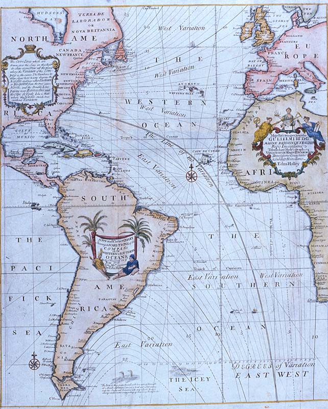
An early contributor to thematic mapping in England was the English astronomer Edmond Halley (1656–1742), who introduced the Enlightenment conception of the thematic map as a tool for scientific thinking. His first significant cartographic contribution was a star chart of the constellations of the Southern Hemisphere, made during his stay on St. Helena and published in 1686. In that same year he also published his first terrestrial map in an article about trade winds, and this map is called the first meteorological chart. In 1701 he published the "New and Correct Chart Shewing the Variations of the Compass", see first image, the first chart to show lines of equal magnetic variation and possibly the first isarithmic map. Early chorochromatic (nominal area-class) maps also appeared in the late 18th century as scientific instruments for exploring geographic phenomena such as geology
Geology () is a branch of natural science concerned with Earth and other Astronomical object, astronomical objects, the features or rock (geology), rocks of which it is composed, and the processes by which they change over time. Modern geology ...
and language
Language is a structured system of communication. The structure of a language is its grammar and the free components are its vocabulary. Languages are the primary means by which humans communicate, and may be conveyed through a variety of ...
.
The early to middle 19th century could be considered, as Robinson called it, a "golden age" of thematic mapping, when many of the current techniques were invented or further developed. For example, the earliest known choropleth map
A choropleth map () is a type of statistical thematic map that uses pseudocolor, i.e., color corresponding with an aggregate summary of a geographic characteristic within spatial enumeration units, such as population density or per-capita in ...
was created in 1826 by Charles Dupin. Based on this work Louis-Léger Vauthier (1815–1901) developed the population contour map
A contour line (also isoline, isopleth, or isarithm) of a function of two variables is a curve along which the function has a constant value, so that the curve joins points of equal value. It is a plane section of the three-dimensional graph ...
, a map that shows the population density
Population density (in agriculture: standing stock or plant density) is a measurement of population per unit land area. It is mostly applied to humans, but sometimes to other living organisms too. It is a key geographical term.Matt RosenberPopu ...
of Paris in 1874 by isolines.Michael Friendly
Michael Louis Friendly (born 1945) is an American-Canadian psychologist, Professor of Psychology at York University in Ontario, Canada, and director of its Statistical Consulting Service, especially known for his contributions to graphical method ...
(2008)"Milestones in the history of thematic cartography, statistical graphics, and data visualization"
One of the most influential early works of thematic cartography was a small booklet of five maps produced in 1837 by Henry Drury Harness as part of a government report on the potential for construction of railroads in Ireland. Included were early chorochromatic and
flow
Flow may refer to:
Science and technology
* Fluid flow, the motion of a gas or liquid
* Flow (geomorphology), a type of mass wasting or slope movement in geomorphology
* Flow (mathematics), a group action of the real numbers on a set
* Flow (psyc ...
maps, and possibly the first proportional point symbol and dasymetric maps.
 Another example of early thematic mapping comes from London physician John Snow. Though disease had been mapped thematically, Snow's cholera map in 1854 is the best-known example of using thematic maps for analysis. Essentially, his technique and methodology anticipated the principles of a geographic information system ( GIS). Starting with an accurate base map of a
 London
London is the capital and List of urban areas in the United Kingdom, largest city of England and the United Kingdom, with a population of just under 9 million. It stands on the River Thames in south-east England at the head of a estuary dow ...
neighborhood which included streets and water pump locations, Snow mapped out the incidence of cholera
Cholera is an infection of the small intestine by some strains of the bacterium '' Vibrio cholerae''. Symptoms may range from none, to mild, to severe. The classic symptom is large amounts of watery diarrhea that lasts a few days. Vomiting an ...
deaths. The emerging pattern centered around one particular pump in Broad Street. At Snow’s request, the handle of the pump was removed, and new cholera cases ceased almost at once. Further investigation of the area revealed that the Broad Street pump was near a cesspit under the home of the outbreak's first cholera victim.
Charles Joseph Minard has been hailed as perhaps the first master of thematic mapping and information visualization. In the 1850s and 1860s, he integrated thematic maps (especially flow maps) with statistical charts to create visual narratives, most notably his 1869 map of Napoleon's 1812 invasion of Europe.
By the early 20th century, established methods were in place for manually drafting a variety of thematic maps, but they were still produced in far fewer numbers than general reference maps, and occupied a relatively small portion of cartographic education. Their popularity vastly increased in the second half of the century, due to several influences: first, the Quantitative revolution in geography and the rise of cartography as an academic discipline, both of which increased the role of thematic maps as tools for scientific analysis and communication; second, technology that facilitates map design and production, especially the personal computer
A personal computer (PC) is a multi-purpose microcomputer whose size, capabilities, and price make it feasible for individual use. Personal computers are intended to be operated directly by an end user, rather than by a computer expert or te ...
, the geographic information system
A geographic information system (GIS) is a type of database containing geographic data (that is, descriptions of phenomena for which location is relevant), combined with software tools for managing, analyzing, and visualizing those data. In a ...
(GIS), graphics software, and the Internet
The Internet (or internet) is the global system of interconnected computer networks that uses the Internet protocol suite (TCP/IP) to communicate between networks and devices. It is a '' network of networks'' that consists of private, p ...
; and third, the widespread availability of large volumes of data, notably the first digital releases of national census
A census is the procedure of systematically acquiring, recording and calculating information about the members of a given population. This term is used mostly in connection with national population and housing censuses; other common censuses inc ...
es in the 1990s.
Purposes
The most common purpose of a thematic map is to portray the geographic distribution of one or more phenomena. Sometimes this distribution is already familiar to the cartographer, who wants to communicate it to an audience, while at other times the map is created to discover previously unknown patterns (as a form of Geovisualization). Thematic maps accomplish these two goals by leveraging the natural ability of the humanvisual perception
Visual perception is the ability to interpret the surrounding environment through photopic vision (daytime vision), color vision, scotopic vision (night vision), and mesopic vision (twilight vision), using light in the visible spectrum ref ...
system to recognize patterns in a complex visual field, which is necessary for common tasks such as object recognition. A thematic map usually focuses on visualizing the distribution of values of a single property or type of feature (a ''univariate'' map), occasionally including two ('' bivariate'') or more (''multivariate
Multivariate may refer to:
In mathematics
* Multivariable calculus
* Multivariate function
* Multivariate polynomial
In computing
* Multivariate cryptography
* Multivariate division algorithm
* Multivariate interpolation
* Multivariate optical c ...
'') properties or feature types that are hypothesized to be statistically correlated or otherwise closely related.
By focusing on a single subject matter, the thematic map is typically intended to be used for a narrower range of tasks than a reference map. These tasks tend to fall into three types:
# Provide specific information about particular locations. For example, "what is the Hispanic proportion of Chicago?"
# Provide general information about spatial patterns. For example, "where is maize grown?"
# Compare patterns on two or more maps. For example, "how did the vote change between the 2008
File:2008 Events Collage.png, From left, clockwise: Lehman Brothers went bankrupt following the Subprime mortgage crisis; Cyclone Nargis killed more than 138,000 in Myanmar; A scene from the opening ceremony of the 2008 Summer Olympics in Beijing; ...
and 2012 U.S. presidential elections?"
Mapping methods
Cartographers use many methods to create thematic maps. These are often referred to as different types of ''thematic maps'', but it is more proper to call them types of ''thematic map layers'' or ''thematic mapping techniques'', as they can be combined with each other (forming a bivariate or multivariate map) and with one or more reference map layers in a single map. For example, a cartogram technique could be used to distort the sizes of countries proportional to one variable, with the countries being filled with colors representing a second variable using the choropleth technique.Choropleth
A choropleth map shows statistical data aggregated over predefined regions, such as countries or states, by coloring or shading these regions. For example, countries with higher rates of infant mortality might appear darker on a choropleth map. The summary variable being mapped may be nominal or quantitative, but usually represents a geographic field. Visual variables filling each region are used to represent each aggregate summary value: hue is commonly used for qualitative variables, such as predominant land use, while lightness is most common for quantitative differences, such as population density. This technique is very popular due to the widespread availability of such aggregate statistical data as well as GIS data for common regions, but the loss of information inherent in aggregate information can result in interpretation issues such as the Ecological fallacy and the Modifiable areal unit problem.
Proportional point symbol
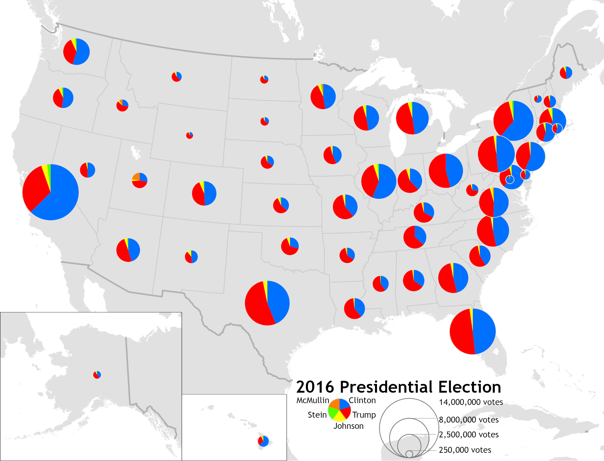
The proportional symbol technique uses point symbols of different sizes (height, length, area, or volume) to represent quantitative statistical values associated with different areas or locations within the map. For example, a disc may be shown at the location of each city in a map, with the area of the disc being proportional to the population of the city. This type of map is useful for visualization when raw data cannot be dealt with as a ratio or proportion. Although circles are the most typical symbol because they are more compact due to their low perimeter to area ratio, studies show that it is easier for the reader to estimate the size of the symbol if it is a square or a bar. Proportional symbol maps are commonly used for variables representing total counts or amounts.
Cartogram
A cartogram is a map that intentionally distorts geographic space based on a given variable, usually by scaling features so their size is proportional to their value of the variable. For example, the countries of the world could be scaled proportional to their population. The features being distorted may be lines (such as making the length of subway lines proportional to travel time), but most commonly it is regions that are scaled. The distorted shapes are sometimes used as a basis for additional thematic mapping techniques, such as the choropleth.Isarithmic or isoline
Isarithmic maps, also known ascontour map
A contour line (also isoline, isopleth, or isarithm) of a function of two variables is a curve along which the function has a constant value, so that the curve joins points of equal value. It is a plane section of the three-dimensional graph ...
s or isoline maps, depict continuous quantitative fields (sometimes conceptualized as "statistical surfaces" by cartographers), such as precipitation or elevation by partitioning space into regions, each containing a consistent range of values of the field. The boundary of each region, an ''isoline'', thus represents the set of locations of constant value. For example, on a topographic map, each contour line indicates an area at the listed elevation.

Chorochromatic or area-class
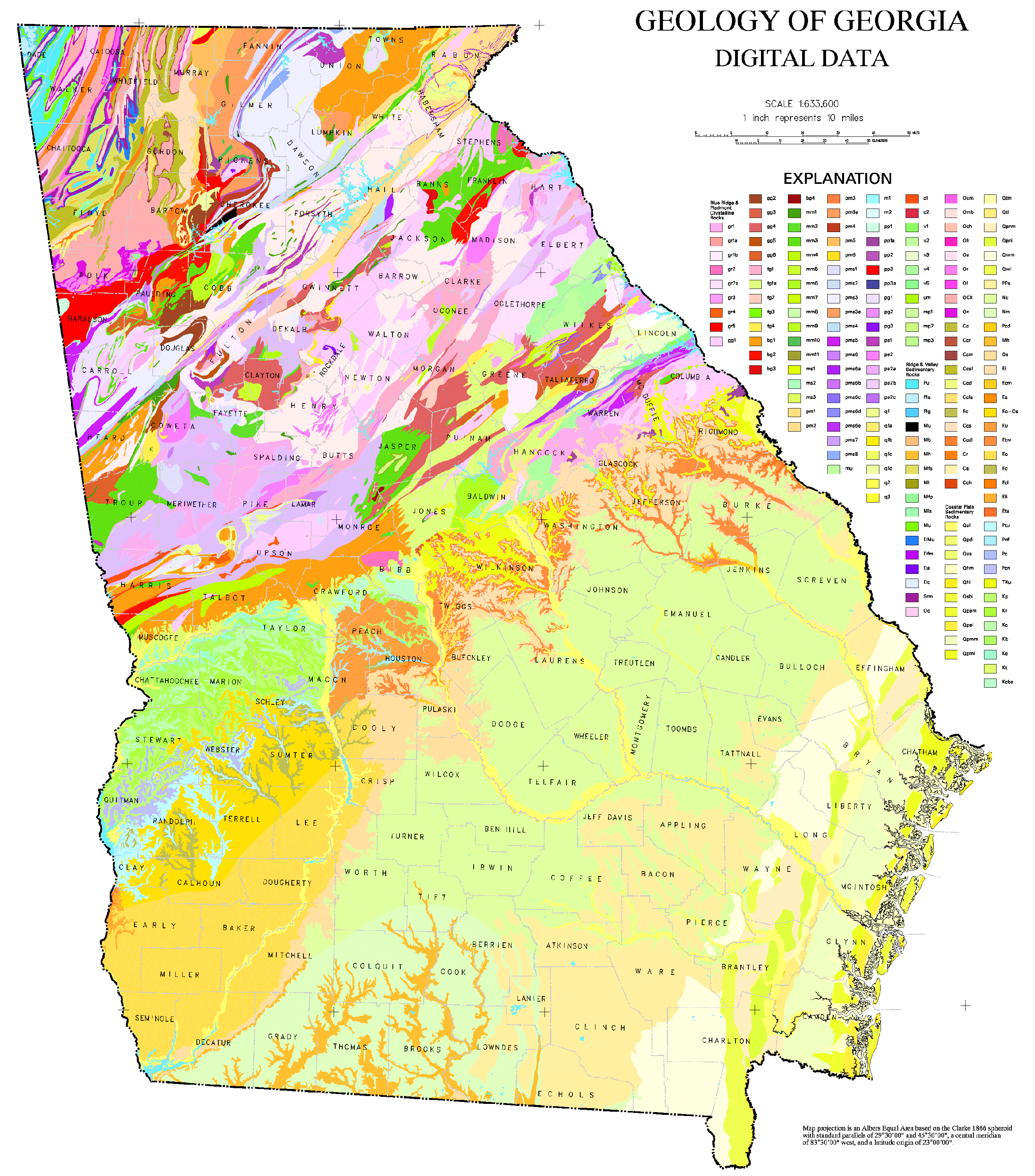
A chorochromatic or area-class map represents a categorical or nominal variable distributed over space (also known as a discrete field), by using different areasymbols
A symbol is a mark, sign, or word that indicates, signifies, or is understood as representing an idea, object, or relationship. Symbols allow people to go beyond what is known or seen by creating linkages between otherwise very different co ...
(usually color hue) to represent regions of homogeneous value. Common examples include maps of surface geology, soil
Soil, also commonly referred to as earth or dirt, is a mixture of organic matter, minerals, gases, liquids, and organisms that together support life. Some scientific definitions distinguish ''dirt'' from ''soil'' by restricting the former ...
, vegetation
Vegetation is an assemblage of plant species and the ground cover they provide. It is a general term, without specific reference to particular taxa, life forms, structure, spatial extent, or any other specific botanical or geographic charac ...
, land use
Land use involves the management and modification of natural environment or wilderness into built environment such as settlements and semi-natural habitats such as arable fields, pastures, and managed woods. Land use by humans has a long ...
, city zoning, and climate type. p.129

Dot
Adot distribution map
A dot distribution map (or a dot density map or simply a dot map) is a type of thematic map that uses a point symbol to visualize the geographic distribution of a large number of related phenomena. Dot maps are a type of unit visualizations that ...
places small point symbols over a given space to indicate the distribution of a given phenomenon. The location of each dot may represent the actual location of a single instance, as in the map made by Dr. Snow during the 1854 Broad Street cholera outbreak
Events
January–March
* January 4 – The McDonald Islands are discovered by Captain William McDonald aboard the ''Samarang''.
* January 6 – The fictional detective Sherlock Holmes is perhaps born.
* January 9 – The Teut ...
, where each dot represented one death due to cholera. Alternatively, aggregate statistical data (the same used in choropleth maps) may be mapped by randomly placing dots within each aggregation region (e.g., country, state, county) to show the general density of instances; this latter form is usually called a ''dot density map''.
Flow
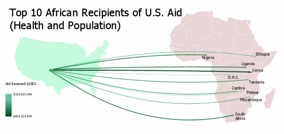
 Flow maps are maps that use line symbols to portray movement or relationship between two or more places, such as air travel, monetary aid, or economic trade. The lines may be schematic straight lines or curves, or may represent the actual travel route. Some flow maps simply show the presence of connections, while others use visual variables such as size (width) or color to represent the properties of each connection.
Dasymetric
A dasymetric map is an alternative to a choropleth map. As with a choropleth map, data are collected by enumeration units. But instead of mapping the data so that the region appears uniform, ''ancillary information'' is used to estimate a more detailed distribution of the phenomenon within each enumeration unit. For example, land cover data (forest, water, grassland, urbanization) may be used to refine the distribution of county-level population density.Reference layers
While the thematic information is the core of a thematic map, other geographic features may also be included as ''reference information''. The primary purpose of reference information is to establish the location of the thematic information in a context understood by the map readers (i.e., to answer questions such as "where is this red region in the real world?"). Common reference layers include government administrative boundaries, roads, cities, a latitude/longitude graticule, or eventerrain
Terrain or relief (also topographical relief) involves the vertical and horizontal dimensions of land surface. The term bathymetry is used to describe underwater relief, while hypsometry studies terrain relative to sea level. The Latin word ...
. These layers play a secondary role in the use of the map, so they are usually included sparingly, and symbolized to be low in the visual hierarchy, but not so faded that they cannot be used.
See also
* André-Michel Guerry *Nautical chart
A nautical chart is a graphic representation of a sea area and adjacent coastal regions. Depending on the scale of the chart, it may show depths of water and heights of land ( topographic map), natural features of the seabed, details of the co ...
* Topographic map
References
Further reading
* * * * * * {{Authority control Map types Diagrams