Long S on:
[Wikipedia]
[Google]
[Amazon]
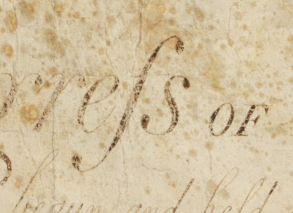 The long s , also known as the medial s or initial s, is an archaic form of the


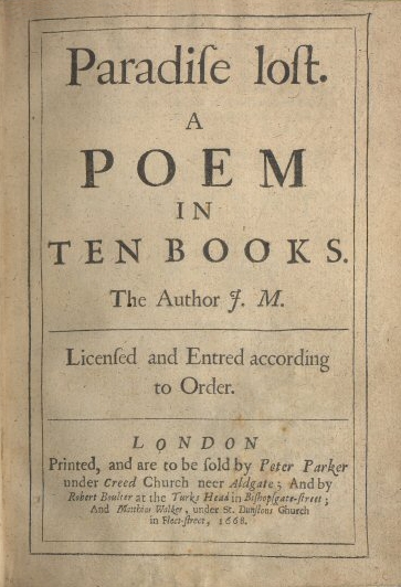
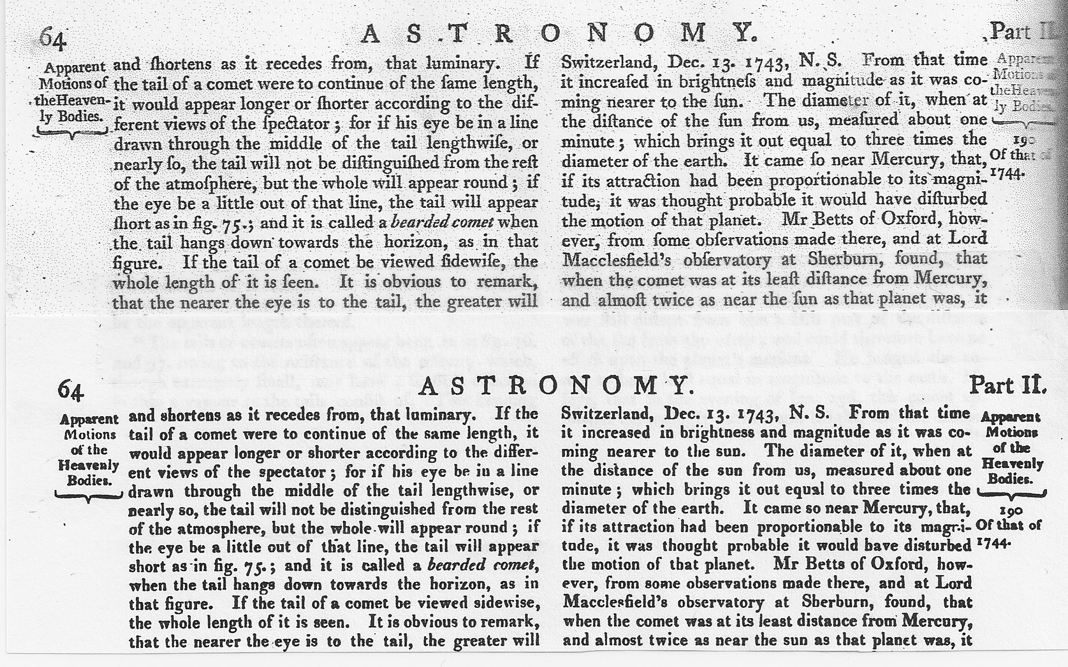
 The long s was derived from the old
  The long s was used in ligatures in various languages. Three examples were for , , and , besides the German letter . The long s survives in Fraktur typefaces.
The present-day German letter ''ß'' (german: Eszett or ; also used in Low German and historical Upper Sorbian orthographies) is generally considered to have originated in a ( Fraktur) ligature of (which is supported by the fact that the second part of the grapheme usually resembles a Fraktur ''z'': , hence ; see '' ß'' for details), although in Antiqua, the ligature of is used instead. (An alternative hypothesis claims that the German letter ''ß'' originated in
  Some old orthographic systems of Slavonic and Baltic languages used ''ſ'' and ''s'' as two separate letters with different phonetic values. For example, the
 After its decline and disappearance in printing in the early years of the 19th century, the long s persisted into the second half of the century in manuscript. In handwriting used for correspondence and diaries, its use for a single ''s'' seems to have disappeared first: most manuscript examples from the 19th century use it for the first ''s'' in a double ''s''. For example,
*
 The long s survives in elongated form, with an italic-styled curled descender, as the integral symbol ∫ used in calculus.
 The long s , also known as the medial s or initial s, is an archaic form of the
 lowercase
Letter case is the distinction between the letters that are in larger uppercase or capitals (or more formally ''majuscule'') and smaller lowercase (or more formally ''minuscule'') in the written representation of certain languages. The writing ...
letter . It replaced the single ''s'', or one or both of the letters ''s'' in a 'double ''s''ligature
Ligature may refer to:
* Ligature (medicine), a piece of suture used to shut off a blood vessel or other anatomical structure
** Ligature (orthodontic), used in dentistry
* Ligature (music), an element of musical notation used especially in the me ...
letter , ('' eszett'' or harp s.
Rules
This list of rules for the long s is not exhaustive, and it applies only to books printed during the 17th and 18th centuries in English-speaking countries. Similar rules exist for other European languages. * A round s is always used at the end of a word ending with s: "his", "complains", "ſucceſs" ** However, long s is maintained in abbreviations such as "ſ." for "ſubſtantive" (substantive), and "Geneſ." for "Geneſis" (Genesis) * Before an apostrophe (indicating an omitted letter), a round s is used: "us'd" and "clos'd" * Before and after an '' f'', a round s is used: "offset", "ſatisfaction." * Before abreaking hyphen
In computing and typesetting, a soft hyphen (ISO 8859: 0xAD, Unicode , HTML: ­ or ­ or ­) or syllable hyphen (EBCDIC: 0xCA), abbreviated SHY, is a code point reserved in some coded character sets for the purpose of breaki ...
at the end of the line, a long s must be used: "Shaftſ-bury". (When hyphenation was not required, the word was spelled , with a round s.)
* In the 17th century, the round s was used before ''k'' and ''b'': "ask", "husband"; in the 18th century: "aſk" and "huſband".
Otherwise, long s is used: "ſong", "ſubſtitute".
In handwriting, these rules do not apply—the long s is usually confined to preceding a round s, either in the middle or at the end of a word—for example, "aſsure", "Bleſsings".
History


 The long s was derived from the old
 Roman cursive
Roman cursive (or Latin cursive) is a form of handwriting (or a script) used in ancient Rome and to some extent into the Middle Ages. It is customarily divided into old (or ancient) cursive and new cursive.
Old Roman cursive
Old Roman cursiv ...
medial ''s''. When the distinction between majuscule (uppercase) and minuscule
Letter case is the distinction between the letters that are in larger uppercase or capitals (or more formally ''majuscule'') and smaller lowercase (or more formally ''minuscule'') in the written representation of certain languages. The writing ...
(lowercase) letter forms became established, toward the end of the eighth century, it developed a more vertical form.. During this period, it was occasionally used at the end of a word, a practice that quickly died but that was occasionally revived in Italian
Italian(s) may refer to:
* Anything of, from, or related to the people of Italy over the centuries
** Italians, an ethnic group or simply a citizen of the Italian Republic or Italian Kingdom
** Italian language, a Romance language
*** Regional Ita ...
printing between about 1465 and 1480. Thus, the general rule that the long s never occurred at the end of a word is not strictly correct, although the exceptions are rare and archaic. The double ''s'' in the middle of a word was also written with a long s and a short s, as in: "Miſsiſsippi". In German typography
Typography is the art and technique of arranging type to make written language legible, readable and appealing when displayed. The arrangement of type involves selecting typefaces, point sizes, line lengths, line-spacing ( leading), ...
, the rules are more complicated: short s also appears at the end of each component within a compound word, and there are more detailed rules and practices for special cases.
The long s is often confused with the minuscule '' f'', sometimes even having an ''f''-like nub at its middle but on the left side only in various Roman typefaces and in blackletter. There was no nub in its italic type form, which gave the stroke a descender that curled to the left and which is not possible without kerning in the other type forms mentioned. For this reason, the short s was also normally used in combination with ''f'': for example, in "ſatisfaction".
The nub acquired its form in the blackletter style of writing. What looks like one stroke was actually a wedge pointing downward. The wedge's widest part was at that height ( x-height) and capped by a second stroke that formed an ascender that curled to the right. Those styles of writing, and their derivatives, in type design had a crossbar at the height of the nub for letters ''f'' and ''t'', as well as for ''k''. In Roman type, except for the crossbar on medial ''s'', all other cross bars disappeared.
 The long s was used in ligatures in various languages. Three examples were for , , and , besides the German letter . The long s survives in Fraktur typefaces.
The present-day German letter ''ß'' (german: Eszett or ; also used in Low German and historical Upper Sorbian orthographies) is generally considered to have originated in a ( Fraktur) ligature of (which is supported by the fact that the second part of the grapheme usually resembles a Fraktur ''z'': , hence ; see '' ß'' for details), although in Antiqua, the ligature of is used instead. (An alternative hypothesis claims that the German letter ''ß'' originated in
 Tironian notes
Tironian notes ( la, notae Tironianae, links=no) are a set of thousands of signs that were formerly used in a system of shorthand (Tironian shorthand) dating from the 1st century BCE and named after Tiro, a personal secretary to Marcus Tullius Ci ...
.)
 Some old orthographic systems of Slavonic and Baltic languages used ''ſ'' and ''s'' as two separate letters with different phonetic values. For example, the
 Bohorič alphabet
The Bohorič alphabet ( sl, bohoričica) was an orthography used for Slovene between the 16th and 19th centuries.
Origins
Its name is derived from Adam Bohorič, who codified the alphabet in his book ''Articae Horulae Succisivae''. It was print ...
of the Slovene language included , , , . In the original version of the alphabet, majuscule was shared by both letters.
Also, some Latin alphabets devised in the 1920s for some Caucasian languages
The Caucasian languages comprise a large and extremely varied array of languages spoken by more than ten million people in and around the Caucasus Mountains, which lie between the Black Sea and the Caspian Sea.
Linguistic comparison allows t ...
used the for some specific sounds. These orthographies were in actual use until 1938. Some of these developed a capital form which resembles the IPA letter see .
Decline
In general, the long s fell out of use in Roman and italic typefaces in professional printing well before the middle of the 19th century. It rarely appears in good-quality London printing after 1800, though it lingers provincially until 1824 and is found in handwriting into the second half of the nineteenth century,. being sometimes seen later on in archaic or traditionalist printing such as printed collections of sermons. Woodhouse's ''The Principles of Analytical Calculation'', published by the Cambridge University Press in 1803, uses the long s throughout its Roman text.Abandonment by printers and type founders
The long s disappeared from new typefaces rapidly in the mid-1790s, and most printers who could afford to do so had discarded older typefaces by the early years of the 19th century. Pioneer of type design John Bell (1746–1831), who started the British Letter Foundry in 1788, commissioned theWilliam Caslon
William Caslon I (1692/1693 – 23 January 1766), also known as William Caslon the Elder,Oxford Dictionary of National Biography was an English typefounder. The distinction and legibility of his type secured him the patronage of the leading ...
Company to produce a new modern typeface for him and is often "credited with the demise of the long s".
Unlike the 1755 edition, which uses the long s throughout, the 1808 edition of the ''Printer's Grammar'' describes the transition away from the use of the long s among type founders and printers in its list of available sorts:
An individual instance of an important work using ''s'' instead of the long s occurred in 1749, with Joseph Ames's ''Typographical Antiquities'', about printing in England 1471–1600, but "the general abolition of long s began with John Bell's British Theatre (1791)".
In Spain, the change was mainly accomplished between the years 1760 and 1766; for example, the multivolume made the switch with volume 16 (1762). In France, the change occurred between 1782 and 1793. Printers in the United States stopped using the long s between 1795 and 1810: for example, acts of Congress were published with the long s throughout 1803, switching to the short s in 1804. In the US, a late use of the long s was in '' Low's Encyclopaedia'', which was published between 1805 and 1811. Its reprint in 1816 was one of the last such uses recorded in America. The most recent recorded use of the long s typeset among English printed Bibles can be found in the Lunenburg, Massachusetts
Lunenburg is a town in Worcester County, Massachusetts, United States. The population was 11,946 at the 2020 census.
History
Lunenburg was first settled by Europeans in 1718 and was officially incorporated in 1728. The name stems from one of t ...
, 1826 printing by W. Greenough and Son. The same typeset was used for the 1826 printed later by W. Greenough and Son, and the statutes of the United Kingdom
The United Kingdom of Great Britain and Northern Ireland, commonly known as the United Kingdom (UK) or Britain, is a country in Europe, off the north-western coast of the European mainland, continental mainland. It comprises England, Scotlan ...
's colony Nova Scotia also used the long s as late as 1816. Some examples of the use of the long and short s among specific well-known typefaces and publications in the UK include the following:
* The Caslon
Caslon is the name given to serif typefaces designed by William Caslon I (c. 1692–1766) in London, or inspired by his work.
Caslon worked as an engraver of punches, the masters used to stamp the moulds or matrices used to cast metal ty ...
typeface of 1732 has the long s. Philip Gaskell, ''New Introduction to Bibliography'', Clarendon, 1972, p. 210, Figs 74, 75.
* The Caslon typeface of 1796 has the short s only.
* In the UK, '' The Times'' of London made the switch from the long to the short s with its issue of 10 September 1803.
* The Catherwood typeface of 1810 has the short s only.
* '' Encyclopædia Britannica'' 5th edition, completed in 1817, was the last edition to use the long s. The 1823, 6th edition uses the short s.
* The Caslon typeface of 1841 has the short s only.
* Two typefaces from Stephenson Blake, both 1838–1841, have the short s only.
When the War of 1812 began, the contrast between the nonuse of the long s by the United States, and its continued use by the United Kingdom, is illustrated by the Twelfth US Congress's use of the short s of today in the US declaration of war against the United Kingdom, and, in contrast, the continued use of long s within the text of Isaac Brock's counterpart document responding to the declaration of war by the United States.
Early editions of Scottish poet Robert Burns
Robert Burns (25 January 175921 July 1796), also known familiarly as Rabbie Burns, was a Scottish poet and lyricist. He is widely regarded as the national poet of Scotland and is celebrated worldwide. He is the best known of the poets who hav ...
that have lost their title page can be dated by their use of the long s; that is, Dr. James Currie's edition of the ''Works of Robert Burns'' (Liverpool, 1800 and many reprintings) does not use the long s, while editions from the 1780s and early 1790s do.
In printing, instances of the long s continue in rare and sometimes notable cases in the UK until the end of the 19th century, possibly as part of a consciously antiquarian revival of old-fashioned type. For example,
* The Chiswick Press reprinted the Wyclyffite New Testament in 1848 in the Caslon typeface, using the long s; Chiswick Press, run by Charles Whittingham II (nephew of Charles Whittingham
Charles Whittingham (16 June 1767 – 5 January 1840) was an English printer.
Biography
He was born at Caludon or Calledon, Warwickshire, the son of a farmer, and was apprenticed to a Coventry printer and bookseller. In 1789 he set up a smal ...
) from c. 1832–1870s, reprinted classics like Geoffrey Chaucer's '' The Canterbury Tales'' in a font of Caslon that included the long s.
* The "antiqued" first edition of Thackeray
William Makepeace Thackeray (; 18 July 1811 – 24 December 1863) was a British novelist, author and illustrator. He is known for his satirical works, particularly his 1848 novel ''Vanity Fair'', a panoramic portrait of British society, and th ...
's '' The History of Henry Esmond'' (1852), a historical novel set in the eighteenth century, prints long s, and not just when doubled as in "mistreſs's".
* Mary Elizabeth Coleridge's first volume of poetry, ''Fancy's Following'', published in 1896, was printed with the long s.
* Collections of sermons were published using the long s until the end of the 19th century.
Eventual abandonment in handwriting
 After its decline and disappearance in printing in the early years of the 19th century, the long s persisted into the second half of the century in manuscript. In handwriting used for correspondence and diaries, its use for a single ''s'' seems to have disappeared first: most manuscript examples from the 19th century use it for the first ''s'' in a double ''s''. For example,
*
 Charlotte Brontë
Charlotte Brontë (, commonly ; 21 April 1816 – 31 March 1855) was an English novelist and poet, the eldest of the three Brontë sisters who survived into adulthood and whose novels became classics of English literature.
She enlisted i ...
used the long s, as the first in a double ''s'', in some of her letters, e.g., "Miſs Austen" in a letter to the critic G. H. Lewes
George Henry Lewes (; 18 April 1817 – 30 November 1878) was an English philosopher and critic of literature and theatre. He was also an amateur physiologist. American feminist Margaret Fuller called Lewes a "witty, French, flippant sort of m ...
, 12 January 1848; in other letters, however, she uses the short s, for example in an 1849 letter to Patrick Brontë
Patrick Brontë (, commonly ; born Patrick Brunty; 17 March 1777 – 7 June 1861) was an Irish Anglican priest and author who spent most of his adult life in England. He was the father of the writers Charlotte, Emily, and Anne Brontë, and of ...
, her father. Her husband Arthur Bell Nicholls
Arthur Bell Nicholls (6 January 1819 – 2 December 1906) was the husband of the English novelist Charlotte Brontë. Between 1845 and 1861 Nicholls was one of Patrick Brontë's curates and was married to his eldest surviving child, Charlotte, f ...
used the long s in writing to Ellen Nussey of Brontë's death.
* Edward Lear regularly used the long s in his diaries in the second half of the 19th century; for example, his 1884 diary has an instance in which the first ''s'' in a double ''s'' is long: "Addreſsed".
* Wilkie Collins
William Wilkie Collins (8 January 1824 – 23 September 1889) was an English novelist and playwright known especially for '' The Woman in White'' (1859), a mystery novel and early "sensation novel", and for '' The Moonstone'' (1868), which has b ...
routinely used the long s for the first in a double ''s'' in his manuscript correspondence; for example, he used the long s in the words "mſs" (manuscripts) and "needleſs" in a 1 June 1886 letter to Daniel S. Ford.
For these as well as others, the handwritten long s may have suggested type and a certain formality as well as the traditional. Margaret Mathewson "published" her ''Sketch of 8 Months a Patient in the Royal Infirmary of Edinburgh, A.D. 1877'' of her experiences as a patient of Joseph Lister in the Royal Infirmary of Edinburgh by writing copies out in manuscript. In place of the first ''s'' in a double ''s'', Mathewson recreated the long s in these copies, a practice widely used for both personal and business correspondence by her family, who lived on the remote island of Yell, Shetland. The practice of using the long s in handwriting on Yell, as elsewhere, may have been a carryover from 18th-century printing conventions, but it was not unfamiliar as a convention in handwriting.
Modern usage
 The long s survives in elongated form, with an italic-styled curled descender, as the integral symbol ∫ used in calculus.
 Gottfried Leibniz
Gottfried Wilhelm (von) Leibniz . ( – 14 November 1716) was a German polymath active as a mathematician, philosopher, scientist and diplomat. He is one of the most prominent figures in both the history of philosophy and the history of mathem ...
based the character on the Latin ''summa'' (sum), which he wrote ''ſumma''. This use first appeared publicly in his paper ''De Geometria'', published in ''Acta Eruditorum
(from Latin: ''Acts of the Erudite'') was the first scientific journal of the German-speaking lands of Europe, published from 1682 to 1782.
History
''Acta Eruditorum'' was founded in 1682 in Leipzig by Otto Mencke, who became its first editor, ...
'' of June 1686, but he had been using it in private manuscripts at least since 29 October 1675. The integral of a function with respect to a real variable over the interval is typeset as
:
In linguistics, a similar character (, called ''esh'') is used in the International Phonetic Alphabet, in which it represents the voiceless postalveolar fricative, the first sound in the English word ''ship''.
In Nordic and German-speaking countries, relics of the long s continue to be seen in signs and logos that use various forms of fraktur typefaces. Examples include the logos of the Norwegian newspapers and ; the packaging logo for Finnish pastilles; and the German logo.
The long s exists in some current OpenType digital fonts that are historic revivals, like Caslon
Caslon is the name given to serif typefaces designed by William Caslon I (c. 1692–1766) in London, or inspired by his work.
Caslon worked as an engraver of punches, the masters used to stamp the moulds or matrices used to cast metal ty ...
, Garamond, and Bodoni
Bodoni is the name given to the serif typefaces first designed by Giambattista Bodoni (1740–1813) in the late eighteenth century and frequently revived since. Bodoni's typefaces are classified as Didone or modern. Bodoni followed the ideas o ...
.
In the 1993 Turkmen orthography, represented / ʒ/; however, it was replaced in 1995 by the letter . The capital form was , which was replaced by .
In Unicode
* * A long s with abar diacritic
A bar or stroke is a modification consisting of a line drawn through a grapheme. It may be used as a diacritic to derive new letters from old ones, or simply as an addition to make a grapheme more distinct from others. It can take the form of a v ...
, is encoded as
Solidus or slash
An echo of the long s survives today in the form of the mark , popularly known as a " slash" but formally named asolidus
Solidus (Latin for "solid") may refer to:
* Solidus (coin), a Roman coin of nearly solid gold
* Solidus (punctuation), or slash, a punctuation mark
* Solidus (chemistry), the line on a phase diagram below which a substance is completely solid
* ...
. The mark is an evolution of the long s which was used as the abbreviation for ' shilling' in Britain's pre-decimal currency, written as in "7/6" meaning "seven shillings and six pence". (The name shilling is derived from the Roman coin, the ''solidus
Solidus (Latin for "solid") may refer to:
* Solidus (coin), a Roman coin of nearly solid gold
* Solidus (punctuation), or slash, a punctuation mark
* Solidus (chemistry), the line on a phase diagram below which a substance is completely solid
* ...
''.)
See also
* ß (Eszett) * Insular S (Ꞅ) * Esh (letter) * Integral symbol * R rotundaNotes
References
External links
* . * . * . * . * . {{DEFAULTSORT:S, long History of the English language Typography Palaeographic letters Latin-script letters Letters with final form