Legibility Group on:
[Wikipedia]
[Google]
[Amazon]
 The Legibility Group is a series of serif
 The Legibility Group faces resemble the "modern" or Didone faces of the nineteenth century, with ball terminals, a curled leg on the "R" and a looped "Q". However, stroke contrast is limited and the apertures are held wide open to clearly differentiate letters.
As the name "Ionic No. 5" suggests, the "legibility group" typefaces resembled
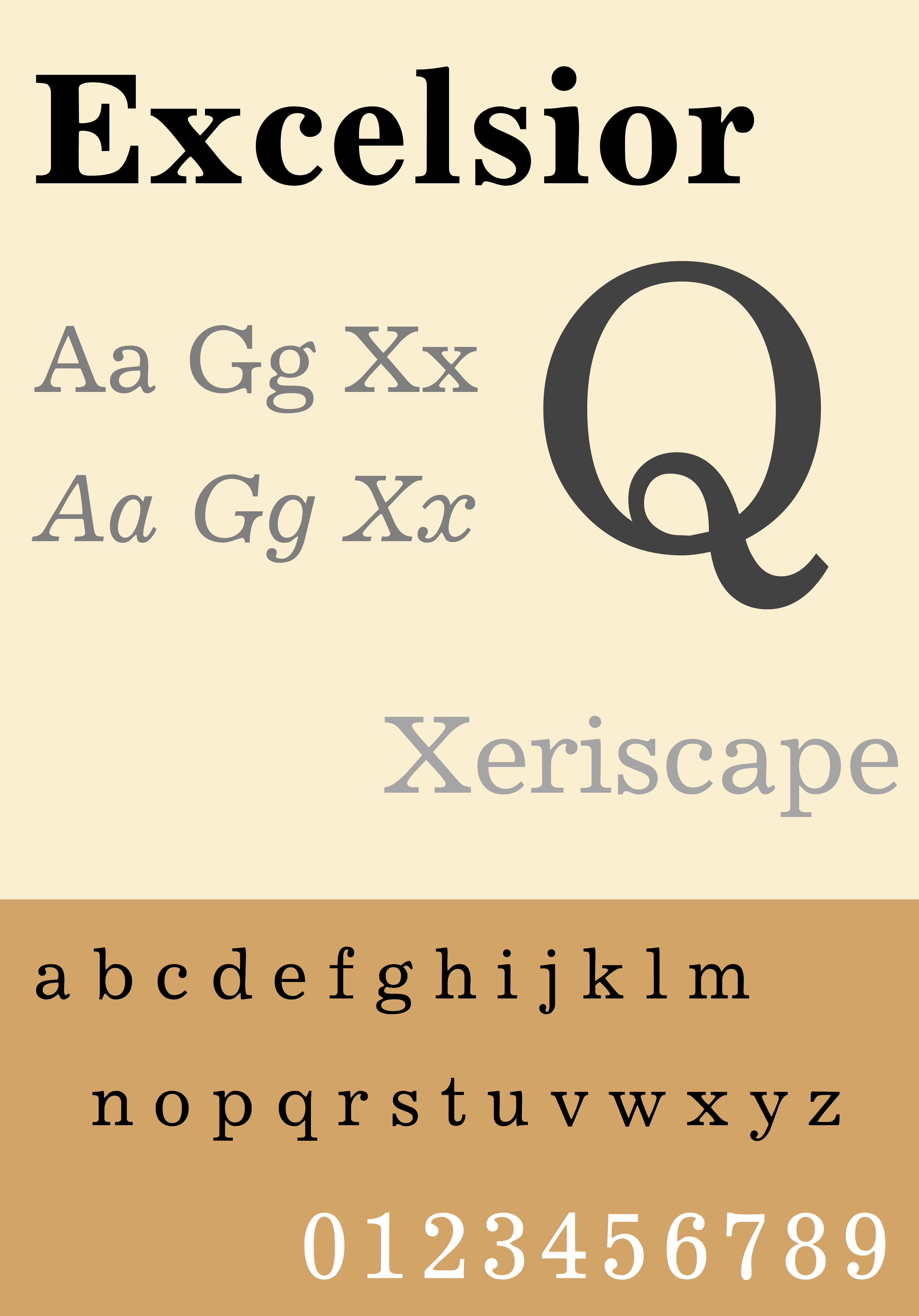
Excelsior Font Family — by Chauncey H. Griffith
Advertisement in the UK ''Daily Mirror''
promoting the changeover to using Ionic
Linotype advertisement
explaining the design's structure Slab serif typefaces Linotype typefaces Newspaper and magazine typefaces Typefaces designed by Chauncey H. Griffith
 The Legibility Group is a series of serif
 typeface
A typeface (or font family) is the design of lettering that can include variations in size, weight (e.g. bold), slope (e.g. italic), width (e.g. condensed), and so on. Each of these variations of the typeface is a font.
There are thousands ...
s created by the American Mergenthaler Linotype Company
The Mergenthaler Linotype Company is a corporation founded in the United States in 1886 to market the Linotype machine (), a system to cast metal type in lines (linecaster) invented by Ottmar Mergenthaler. It became the world's leading manufactu ...
and intended for use in newspaper
A newspaper is a periodical publication containing written information about current events and is often typed in black ink with a white or gray background.
Newspapers can cover a wide variety of fields such as politics, business, sport ...
s on Linotype's hot metal typesetting
In printing and typography, hot metal typesetting (also called mechanical typesetting, hot lead typesetting, hot metal, and hot type) is a technology for typesetting text in letterpress printing. This method injects molten type metal into a ...
system. They were developed in-house by Linotype's design team, led by Chauncey H. Griffith, and released from 1922, when the first member, Ionic No. 5, appeared.
Griffith's aim with the Legibility Group typefaces was to create a design with more body than the rather spindly Didone typefaces previously standard in newspaper printing. To this end, the designs have low contrast in stroke weight, wide open counters and ball terminal
A ball terminal is a design feature of a typeface or glyph where the end of a stroke takes a roughly circular shape, as opposed to a serif
In typography, a serif () is a small line or stroke regularly attached to the end of a larger stroke in ...
s, intended to make the letters clearly distinguishable even when printed on poor-quality newsprint paper.
The Legibility Group typefaces were extremely popular and remained used by many newspapers worldwide throughout the metal type period and beyond; many other newspaper typefaces from other foundries such as Intertype were created based on their design. A notable exception is Monotype's Times New Roman
Times New Roman is a serif typeface. It was commissioned by the British newspaper ''The Times'' in 1931 and conceived by Stanley Morison, the artistic adviser to the British branch of the printing equipment company Monotype Imaging, Monotype, in ...
, which was created to take advantage of the unusually high standard of printing of the ''Times'' in the 1930s. In 1972, British printing manager Allen Hutt
George Allen Hutt (1901–1973) was a British journalist, editor, newspaper designer and Communist and trade union activist.
Life
Hutt came from a family of printers, while his mother Marion was a headmistress. He attended Kilburn Grammar School ...
commented that "the majority of the world's newspapers are typeset in one or another of the traditional Linotype 'Legibility Group', and most of the rest in their derivatives."
Typefaces
The family became a large group due to the creation of slightly different designs for different printing conditions, such as levels of inking used in different newspaper production processes and versions with different x-heights. Linotype carried out a survey of optometrists as part of their research process. * Ionic No. 5 — the first in the family and extremely successful. Sometimes criticised for having too high anx-height
upright 2.0, alt=A diagram showing the line terms used in typography
In typography, the x-height, or corpus size, is the distance between the baseline and the mean line of lowercase letters in a typeface. Typically, this is the height of the let ...
, making lower-case letters very wide and reducing the difference between an "n" and an "h". Bitstream Inc.
Bitstream Inc. was a type foundry that produced digital typefaces. It was founded in 1981 by Matthew Carter and Mike Parker among others. It was located in Marlborough, Massachusetts. The font business, including MyFonts, was acquired by Monotype ...
's News 701 typeface is an unofficial digitisation.
* Textype — similar but with a lower x-height
upright 2.0, alt=A diagram showing the line terms used in typography
In typography, the x-height, or corpus size, is the distance between the baseline and the mean line of lowercase letters in a typeface. Typically, this is the height of the let ...
, giving a more delicate structure with more contrast between letters with and without ascenders.
* Excelsior — reduced x-height and intended for rubber-roller presses. Linotype has described its use as most common "in Europe, where newspaper columns are wide."
*Opticon — heavier, to compensate for printing that deliberately underinks to favour halftones.
*Paragon — lighter, to compensate for newspapers that deliberately overink to favour text and headlines.
*Corona — condensed and large on the body. Walter Tracy
Walter Valentine Tracy RDI (14 February 1914 – 28 April 1995) was an English type designer, typographer and writer.
Biography
Walter Tracy was born in Islington, London and attended Shoreditch Secondary school. At the age of fourteen he wa ...
praised it for carrying "the design of newspaper types to a new level."
Although not part of the family, Linotype marketed its sans-serif family Metro
Metro, short for metropolitan, may refer to:
Geography
* Metro (city), a city in Indonesia
* A metropolitan area, the populated region including and surrounding an urban center
Public transport
* Rapid transit, a passenger railway in an urban ...
and slab serif
In typography, a slab serif (also called ''mechanistic'', ''square serif'', ''antique'' or ''Egyptian'') typeface is a type of serif typeface characterized by thick, block-like serifs. Serif terminals may be either blunt and angular ( Rockwell), ...
face Memphis as effective complements for headings.
Design style
 The Legibility Group faces resemble the "modern" or Didone faces of the nineteenth century, with ball terminals, a curled leg on the "R" and a looped "Q". However, stroke contrast is limited and the apertures are held wide open to clearly differentiate letters.
As the name "Ionic No. 5" suggests, the "legibility group" typefaces resembled
 slab serif
In typography, a slab serif (also called ''mechanistic'', ''square serif'', ''antique'' or ''Egyptian'') typeface is a type of serif typeface characterized by thick, block-like serifs. Serif terminals may be either blunt and angular ( Rockwell), ...
typefaces of the nineteenth century, variously called " Clarendon" or "Ionic", but it is modified from these to have a build suitable for body text. Hutt suggests that the design was based on the popular family of the name Ionic from Miller & Richard
Miller & Richard was a type foundry based in Edinburgh that designed and manufactured metal type. It operated from 1809 to 1952.
The foundry was established by William Miller. He had been works manager of the foundry established by Alexander W ...
and copies from other foundries, slightly bolder than was considered normal for body text during the late nineteenth century. G. Willem Ovink, however, has argued that a more direct influence (although not on the italic) was American Type Founders
American Type Founders (ATF) Co. was a business trust created in 1892 by the merger of 23 type foundries, representing about 85% of all type manufactured in the United States. De Vinne, Theodore Low, ''The Practice of Typography,'' Century Comp ...
' Century Expanded, also a Didone face with reduced contrast, but that Linotype were unwilling to admit any influence from a competitor's work and so chose a name suggesting a more distant inspiration.
Notes
References
Bibliography
* *Consuegra, David. ''American Type Design & Designers.'' Allworth Communications, Inc.: 2004. , *Hutt, Allen. ''Changing Newspaper: Typographic Trends in Britain and America 1622–1972.'' Gordon Fraser.: 1973. , *Macmillan, Neil. ''An A-Z of Type Designers.'' Yale University Press.: 2006. , {{ISBN, 978-0-300-11151-4External links
Excelsior Font Family — by Chauncey H. Griffith
Advertisement in the UK ''Daily Mirror''
promoting the changeover to using Ionic
Linotype advertisement
explaining the design's structure Slab serif typefaces Linotype typefaces Newspaper and magazine typefaces Typefaces designed by Chauncey H. Griffith