Clarendon (typeface) on:
[Wikipedia]
[Google]
[Amazon]
Clarendon is the name of a

 Slab serif lettering and typefaces originated in Britain in the early nineteenth century, at a time of rapid development of new, bolder typefaces for posters and commercial printing. Probably the first slab-serif to appear in print was created by the foundry of Vincent Figgins, and given the name “antique”. Others rapidly appeared, using names such as “Ionic” and “Egyptian”, which had also been used as a name for
  Besley's original Clarendon design was quite compressed, unlike most later 'Clarendons' intended for display setting, which are often quite wide. One of the original target markets for Besley's Clarendon design was to act as a bold face within body text, providing a stronger emphasis than the
 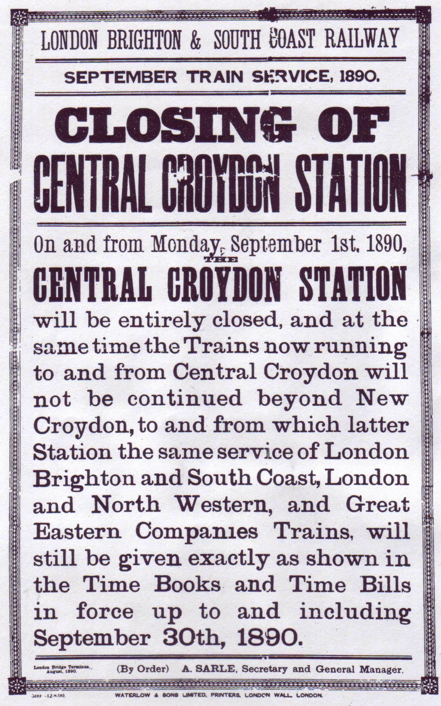 Besley registered the typeface in 1845 under Britain's Ornamental Designs Act of 1842.
The patent expired three years later, and other foundries quickly copied it. Besley was nonetheless successful in business, and became the
  The label "Ionic", originally also used for display faces, has become associated with typefaces with some Clarendon/slab-serif features but intended for body text, following the success of several faces with this name from first


 In the late nineteenth century the basic Clarendon face was radically altered by foundries in the
 Craw Clarendon Bold was used by the
  A heavy bold Clarendon was used for the cast brass locomotive nameplates of the
slab-serif
In typography, a slab serif (also called ''mechanistic'', ''square serif'', ''antique'' or ''Egyptian'') typeface is a type of serif typeface characterized by thick, block-like serifs. Serif terminals may be either blunt and angular ( Rockwell), ...
typeface that was released in 1845 by Thorowgood and Co. (or Thorowgood and Besley) of London, a letter foundry often known as the Fann Street Foundry. The original Clarendon design is credited to Robert Besley, a partner in the foundry, and was originally engraved by punchcutter
Punchcutting is a craft used in traditional typography to cut letter punches in steel as the first stage of making metal type. Steel punches in the shape of the letter would be used to stamp matrices into copper, which were locked into a mould ...
Benjamin Fox, who may also have contributed to its design. Many copies, adaptations and revivals have been released, becoming almost an entire genre of type design.
Clarendons have a bold, solid structure, similar in letter structure to the "modern" serif typefaces popular in the nineteenth century for body text (for instance showing an 'R' with a curled leg and ball terminals on the 'a' and 'c'), but bolder and with less contrast in stroke weight. Clarendon designs generally have a structure with bracketed serifs, which become larger as they reach the main stroke of the letter. Mitja Miklavčič describes the basic features of Clarendon designs (and ones labelled Ionic, often quite similar) as: "plain and sturdy nature, strong bracketed serifs, vertical stress, large x-height, short ascenders and descenders, typeface with little contrast" and supports Nicolete Gray
Nicolete Gray (sometimes Nicolette Gray) (20 July 1911–8 June 1997) was a British scholar of art and calligraphy. She was the youngest daughter of the poet, dramatist and art scholar Laurence Binyon and his wife, writer, editor and transla ...
's description of them as a "cross between the roman
Roman or Romans most often refers to:
* Rome, the capital city of Italy
* Ancient Rome, Roman civilization from 8th century BC to 5th century AD
*Roman people, the people of ancient Rome
*''Epistle to the Romans'', shortened to ''Romans'', a lett ...
eneral-purpose body text typeand slab serif model". Gray notes that nineteenth-century Ionic and Clarendon faces have "a definite differentiation between the thick and the thin strokes", unlike some other more geometric slab-serifs.
Slab serif typefaces had become popular in British lettering
Lettering is an umbrella term that covers the art of drawing letters, instead of simply writing them. Lettering is considered an art form, where each letter in a phrase or quote acts as an illustration. Each letter is created with attention to de ...
and printing over the previous thirty-five years before the original Clarendon's release, both for display use on signage, architectural lettering and posters and for emphasis within a block of text. The Clarendon design was immediately very popular and was rapidly copied by other foundries to become in effect an entire genre of type design. Clarendon fonts proved extremely popular in many parts of the world, in particular for display applications such as posters printed with wood type
In letterpress printing, wood type is movable type made out of wood. First used in China for printing body text, wood type became popular during the nineteenth century for making large display typefaces for printing posters, because it was l ...
. They are therefore commonly associated with wanted poster
A wanted poster (or wanted sign) is a poster distributed to let the public know of a person whom authorities wish to apprehend. They generally include a picture of the person, either a photograph when one is available or of a facial composite ...
s and the American Old West
The American frontier, also known as the Old West or the Wild West, encompasses the geography, history, folklore, and culture associated with the forward wave of American expansion in mainland North America that began with European colonial ...
. A revival of interest took place in the post-war period: Jonathan Hoefler
Jonathan Hoefler (; born August 22, 1970) is an American typeface designer. Hoefler founded the Hoefler Type Foundry in 1989, a type foundry in New York.
Early life
Jonathan Hoefler was born on August 22, 1970, in New York City to Doreen Be ...
comments that "some of the best and most significant Clarendons are twentieth century designs" and highlights the Haas and Stempel foundry's bold, wide Clarendon display face as "a classic that for many people is the epitome of the Clarendon style."
Background

 Slab serif lettering and typefaces originated in Britain in the early nineteenth century, at a time of rapid development of new, bolder typefaces for posters and commercial printing. Probably the first slab-serif to appear in print was created by the foundry of Vincent Figgins, and given the name “antique”. Others rapidly appeared, using names such as “Ionic” and “Egyptian”, which had also been used as a name for
 sans-serif
In typography and lettering, a sans-serif, sans serif, gothic, or simply sans letterform is one that does not have extending features called " serifs" at the end of strokes. Sans-serif typefaces tend to have less stroke width variation than s ...
s. (At the time typeface names were often adjectives, often with little purpose to their name, although they may have been in this case reference to the “blocky”, geometric structure of ancient architecture. There was limited separation between the name of typefaces and genres; if a font proved popular it would often be pirated and reissued by other foundries under the same name.)
Compared to Figgins' "antique", the Clarendon design uses somewhat less emphatic serifs, which are bracketed rather than solid blocks, that widen as they reach the main stroke of the letter. Besley's design was not the first font with this style by at least three years, as typefaces labelled "Ionic" had already appeared in this style (other typefaces would copy this name), but the Clarendon design was particularly popular and its name rapidly copied. Historian James Mosley
James Mosley (born 1935) is a retired librarian and historian whose work has specialised in the history of printing and letter design.
The main part of Mosley's career has been 42 years as Librarian of the St Bride Printing Library in London, whe ...
suggests that an inspiration for these designs may have been the style of handlettered capitals used by copper-plate engravers.
 Besley's original Clarendon design was quite compressed, unlike most later 'Clarendons' intended for display setting, which are often quite wide. One of the original target markets for Besley's Clarendon design was to act as a bold face within body text, providing a stronger emphasis than the
 italic type
In typography, italic type is a cursive font based on a stylised form of calligraphic handwriting. Owing to the influence from calligraphy, italics normally slant slightly to the right. Italics are a way to emphasise key points in a printed ...
that had been used for centuries for this purpose, and in this it matches the quite condensed body text faces of the period. (The modern system of issuing typefaces in families with a companion bold of matched design did not develop until the twentieth century.) Slab serifs had already begun to be used for bold type by the 1840s, but they were often quite lumpy in design and quite poorly matched to the body text face they were intended to complement. Mosley has written that "the Clarendon type of the Besley foundry is indeed the first type actually designed as a ‘related bold’ – that is, made to harmonize in design and align with the roman type
In Latin script typography, roman is one of the three main kinds of historical type, alongside blackletter and italic. Roman type was modelled from a European scribal manuscript style of the 15th century, based on the pairing of inscriptional c ...
s egular weight typefacesit was set with...Before the launch of Clarendon type printers picked out words in slab-serifs or any other heavy type." However, because of the Clarendon design's strong reputation for quality, it was rapidly copied. Historian Nicolete Gray
Nicolete Gray (sometimes Nicolette Gray) (20 July 1911–8 June 1997) was a British scholar of art and calligraphy. She was the youngest daughter of the poet, dramatist and art scholar Laurence Binyon and his wife, writer, editor and transla ...
considered the earlier "Ionic" face from the Caslon Foundry
The Caslon type foundry was a type foundry in London which cast and sold metal type. It was founded by the punchcutter and typefounder William Caslon I, probably in 1720. For most of its history it was based at Chiswell Street, Islington, wa ...
in the same style more effective than Besley's: " esley'sbecame the normal, but it was certainly not the first…in 1842 Caslon have an upper and in 1843 a lower case with the characteristics fully developed, but of a normal width…Besley's ore compressedClarendon is much less pleasing, it has lost emphasis and confidence, and gains only in plausibility."
 Besley registered the typeface in 1845 under Britain's Ornamental Designs Act of 1842.
The patent expired three years later, and other foundries quickly copied it. Besley was nonetheless successful in business, and became the
 Lord Mayor of London
The Lord Mayor of London is the mayor of the City of London and the leader of the City of London Corporation. Within the City, the Lord Mayor is accorded precedence over all individuals except the sovereign and retains various traditional pow ...
in 1869. Theodore De Vinne, a printer who wrote several influential textbooks on typography in the late nineteenth century, wrote that its name was a reference to the Clarendon Press
Oxford University Press (OUP) is the university press of the University of Oxford. It is the largest university press in the world, and its printing history dates back to the 1480s. Having been officially granted the legal right to print books ...
in Oxford
Oxford () is a city in England. It is the county town and only city of Oxfordshire. In 2020, its population was estimated at 151,584. It is north-west of London, south-east of Birmingham and north-east of Bristol. The city is home to the ...
(now part of Oxford University Press
Oxford University Press (OUP) is the university press of the University of Oxford. It is the largest university press in the world, and its printing history dates back to the 1480s. Having been officially granted the legal right to print book ...
), who he claimed immediately used it for dictionaries, although later authors have expressed doubt about this.
With its growing popularity for display use, new versions often changed these proportions. By around 1874, the Fann Street Foundry (now Reed and Fox) could offer in its specimen book Clarendon designs that were condensed, "thin-faced" (light weight), extended, "distended" (extra-wide) and shaded. Revivals continued in the twentieth century, particularly in the 1950s.
 The label "Ionic", originally also used for display faces, has become associated with typefaces with some Clarendon/slab-serif features but intended for body text, following the success of several faces with this name from first
 Miller & Richard
Miller & Richard was a type foundry based in Edinburgh that designed and manufactured metal type. It operated from 1809 to 1952.
The foundry was established by William Miller. He had been works manager of the foundry established by Alexande ...
(intended to be slightly bolder than contemporary expectations for body text proportions) and then Linotype (its 1922 release Ionic No. 5, extremely successful in newspaper printing). Millington notes that "Ionic became a distinct design in its own right" while Hoefler comments that it is now "chiefly associated with bracketed faces of the Century
A century is a period of 100 years. Centuries are numbered ordinally in English and many other languages. The word ''century'' comes from the Latin ''centum'', meaning ''one hundred''. ''Century'' is sometimes abbreviated as c.
A centennial or ...
model". A decline of interest in Clarendons for display use did, however, take place in the early twentieth century: by 1923, American Type Founders
American Type Founders (ATF) Co. was a business trust created in 1892 by the merger of 23 type foundries, representing about 85% of all type manufactured in the United States. De Vinne, Theodore Low, ''The Practice of Typography,'' Century Com ...
, which specialised in creating demand for new designs of display face, could argue "Who remembers the Clarendons in its specimen book, and did not show them (aside from some numerals) in its 1,148 pages. In addition, the market of slab serifs was disrupted by the arrival of new "geometric" slab-serifs inspired by the sans-serifs of the period, such as Beton and Memphis. However, a revival of interest did appear after the war both in America and Europe: Vivian Ridler
Vivian Hughes Ridler, CBE (2 October 1913–11 January 2009), was a printer, typographer and scholar in Britain. He was Printer to the University of Oxford at Oxford University Press from 1958 until his retirement in 1978; and also establis ...
commented that "What seemed pestiferous thirty years ago is now regarded as rugged, virile and essential for an advertising agency's self-respect."
Revivals
A variety of Clarendon revivals have been made since the original design, often adapting the design to different widths and weights. The original Clarendon design, a quite condensed design, did not feature an italic, and many early Clarendon designs, such as wood type headline faces, have capitals only with no lower-case letters, leaving many options for individual adaptation. The original Clarendon became the property ofStephenson Blake
Stephenson Blake is an engineering company based in Sheffield, England. The company was active from the early 19th century as a type founder, remaining until the 1990s as the last active type foundry in Britain, since when it has diversified in ...
in 1906, who marketed a release named Consort, cutting some additional weights (a bold and italics) in the 1950s. The original materials were transferred to the Type Museum collection when Stephenson Blake left the printing business in 1996. Designs for wood type copying Clarendon were made from the mid-1840s onwards.
Most hot metal typesetting companies offered some kind of slab serif; Linotype offered it duplexed to a Roman type so that it could be easily switched in for emphasis. The typeface was reworked by Monotype
Monotyping is a type of printmaking made by drawing or painting on a smooth, non-absorbent surface. The surface, or matrix, was historically a copper etching plate, but in contemporary work it can vary from zinc or glass to acrylic glass. The ...
, with a redesigned release as "New Clarendon" in 1960. Hermann Eidenbenz cut a version, in the early 1950s, issued by Haas and Stempel, and later, Linotype. Freeman Craw drew the ''Craw Clarendon'' family, a once popular American version, released by American Type Founders
American Type Founders (ATF) Co. was a business trust created in 1892 by the merger of 23 type foundries, representing about 85% of all type manufactured in the United States. De Vinne, Theodore Low, ''The Practice of Typography,'' Century Com ...
, in 1955, with light, bold and condensed variants.

Aldo Novarese
Aldo Novarese (29 June 1920 – 16 September 1995) was an Italian type designer who lived and worked mostly in Turin.
Training and career
Born in 1920, he entered the G.B. Paravia Typographic School in Turin, where he obtained a diploma. In 193 ...
drew the Egizio family for Nebiolo, in Turin
Turin ( , Piedmontese language, Piedmontese: ; it, Torino ) is a city and an important business and cultural centre in Northern Italy. It is the capital city of Piedmont and of the Metropolitan City of Turin, and was the first Italian capital ...
, Italy
Italy ( it, Italia ), officially the Italian Republic, ) or the Republic of Italy, is a country in Southern Europe. It is located in the middle of the Mediterranean Sea, and its territory largely coincides with the homonymous geographical ...
. The design included matching italics. David Berlow, of the Font Bureau, released a revival as ''Belizio'' in 1998. The Clarendon Text family, with italics inspired by Egizio, was released by Patrick Griffin of Canada Type.
Volta, sold as Fortune in the U.S., a modern view of Clarendon, was designed by Konrad Friedrich Bauer
Konrad Friedrich Bauer (9 December 1903 – 17 March 1970) was a German type designer who, though not related to founder Johann Christian Bauer, was head of the art department for the Bauer Type Foundry from 1928 until his retirement in 1968. ...
and Walter Baum for the Bauer Type Foundry
Bauer is a German surname meaning "peasant" or "farmer". For notable people sharing the surname, see Bauer (surname).
Bauer may also refer to:
Education and literature
* Bauer's Lexicon, a dictionary of Biblical Greek
* Bauer College of Bu ...
in 1955.
Ray Larabie, of Typodermic, released the Superclarendon family in 2007, using obliques instead of italics. A wide, display-oriented design with small caps and Greek and Cyrillic support, it is bundled with macOS
macOS (; previously OS X and originally Mac OS X) is a Unix operating system developed and marketed by Apple Inc. since 2001. It is the primary operating system for Apple's Mac computers. Within the market of desktop and la ...
.
Sentinel, from Hoefler & Frere-Jones
Hoefler&Co. (H&Co) is a digital type foundry (font design studio) in Woburn, Massachusetts (formerly New York City), founded by type designer Jonathan Hoefler. H&Co designs typefaces for clients and for retail on its website.
The company was fo ...
, another typeface family based on Clarendon with italics added, was released in 2009. Intended to have less eccentric italics suitable for body text use, it was featured heavily in President Barack Obama
Barack Hussein Obama II ( ; born August 4, 1961) is an American politician who served as the 44th president of the United States from 2009 to 2017. A member of the Democratic Party (United States), Democratic Party, Obama was the first Af ...
's 2012 campaign website advertisements.
Besley* from Indestructible Type is an open-source revival with variable font
A variable font (VF) is a font file that is able to store a continuous range of design variants. An entire typeface (font family) can be stored in such a file, with an infinite number of fonts available to be sampled.
The variable font technol ...
versions.
French Clarendon


 In the late nineteenth century the basic Clarendon face was radically altered by foundries in the
 United States
The United States of America (U.S.A. or USA), commonly known as the United States (U.S. or US) or America, is a country Continental United States, primarily located in North America. It consists of 50 U.S. state, states, a Washington, D.C., ...
, resulting in the production of the 'French Clarendon' type style, which had enlarged block serifs at top and bottom. This style is also traditionally associated with wild-west printing; it is commonly seen on circus posters and wanted notices in western movies. However, it was actually used in many parts of the world at the time.
The concept, now called as reverse-contrast or reverse-stress type, predated Clarendon altogether. It began, possibly around 1821 in Britain, as a parody of the elegant Didone types of the period. It was created by inverting the contrast of these designs, making the thin strokes thick and the thick strokes thin. The result was a slab serif
In typography, a slab serif (also called ''mechanistic'', ''square serif'', ''antique'' or ''Egyptian'') typeface is a type of serif typeface characterized by thick, block-like serifs. Serif terminals may be either blunt and angular ( Rockwell), ...
design because of the serifs becoming thick. (In the 19th century, these designs were called ''Italian'' because of their exotic appearance, but this name is problematic since the designs have no clear connection with Italy; they do slightly resemble '' capitalis rustica'' Roman writing, but this may be a coincidence. For similar reasons they were also called ''Egyptian'' or ''Reversed Egyptian'', Egyptian being an equally arbitrary name for slab serifs of the period.)De Vinne, Theodore Low, ''The Practice of Typography, Plain Printing Types,'' The Century Co., N.Y.C., 1902, p. 333.
Intended as attention-grabbing novelty display designs rather than as serious choices for body text, within four years of their introduction the printer Thomas Curson Hansard
Thomas Curson Hansard (6 November 17765 May 1833) was an English pressman, son of the printer Luke Hansard.
Life
In 1803, he established a press of his own in Paternoster Row. In the same year, William Cobbett, a newspaperman, began to print t ...
had described them as 'typographic monstrosities'. Derivatives of this style persisted, and the concept of very thick serifs ultimately merged with the Clarendon genre of type. The advantage of French-Clarendon type was that it allowed very large, eye-catching serifs while the letters remained narrow, suiting the desire of poster-makers for condensed but very bold type. Fine printers were less impressed by it: DeVinne commented in 1902 that "To be hated, it needs but to be seen."
Because of their quirky, unusual design, lighter and hand-drawn versions of the style were popular for uses such as film posters in the 1950s and 60s. A variety of adaptations have been made of the style, Robert Harling's Playbill and more recently Adrian Frutiger
Adrian Johann Frutiger ( ; 24 May 1928 – 10 September 2015) was a Swiss typeface designer who influenced the direction of type design in the second half of the 20th century. His career spanned the hot metal, phototypesetting and digital ...
's Westside, URW++
URW Type Foundry GmbH (formerly URW++ Design & Development GmbH) is a type foundry based in Hamburg, Germany. The foundry has its own library with more than 500 font families. The company specializes in customized corporate typefaces and the d ...
's Zirkus and Bitstream's P. T. Barnum.
A radically different approach has been that of Trilby by David Jonathan Ross, who has written on the history of the genre. Released by Font Bureau, it is a modernisation reminiscent of Clarendon revivals from the 1950s. It attempts to adapt the style to use in a much wider range of settings, going so far as to be usable for body text.
Terminology
The following terms have been used for Clarendons and related slab serifs. Common meanings have been added, but they have often not been consistently applied. Many modern writers as a result ignore them and prefer the term slab-serif, providing individual descriptions of the features of specific designs. * Clarendon - often particularly used to refer to slab-serifs with 'bracketed’ serifs. * Antique - the first name used for slab-serifs, but in France often used for sans-serifs. Sometimes taken to mean slab-serifs in the nineteenth-century style with Didone letterforms and thick, square slab-serifs. * Egyptian/Egyptienne - mostly used for slab-serifs generally, although first used by the Caslon Foundry in naming their sans-serif, the first made. Continued to be used as a name for "geometric" slab-serifs appearing in the twentieth century, and so several geometric slab-serifs had Egyptian-themed names, including Memphis, Cairo andKarnak
The Karnak Temple Complex, commonly known as Karnak (, which was originally derived from ar, خورنق ''Khurnaq'' "fortified village"), comprises a vast mix of decayed temples, pylons, chapels, and other buildings near Luxor, Egypt. Constru ...
.
* Ionic - in the nineteenth century used as a name for slab-serifs. In the twentieth century this term became used to mean text faces with some Clarendon-style features, because of an influential body text face of this name from Linotype - this followed from previous faces of the same name only slightly bolder than text proportions from Miller & Richard
Miller & Richard was a type foundry based in Edinburgh that designed and manufactured metal type. It operated from 1809 to 1952.
The foundry was established by William Miller. He had been works manager of the foundry established by Alexande ...
.
Appearances
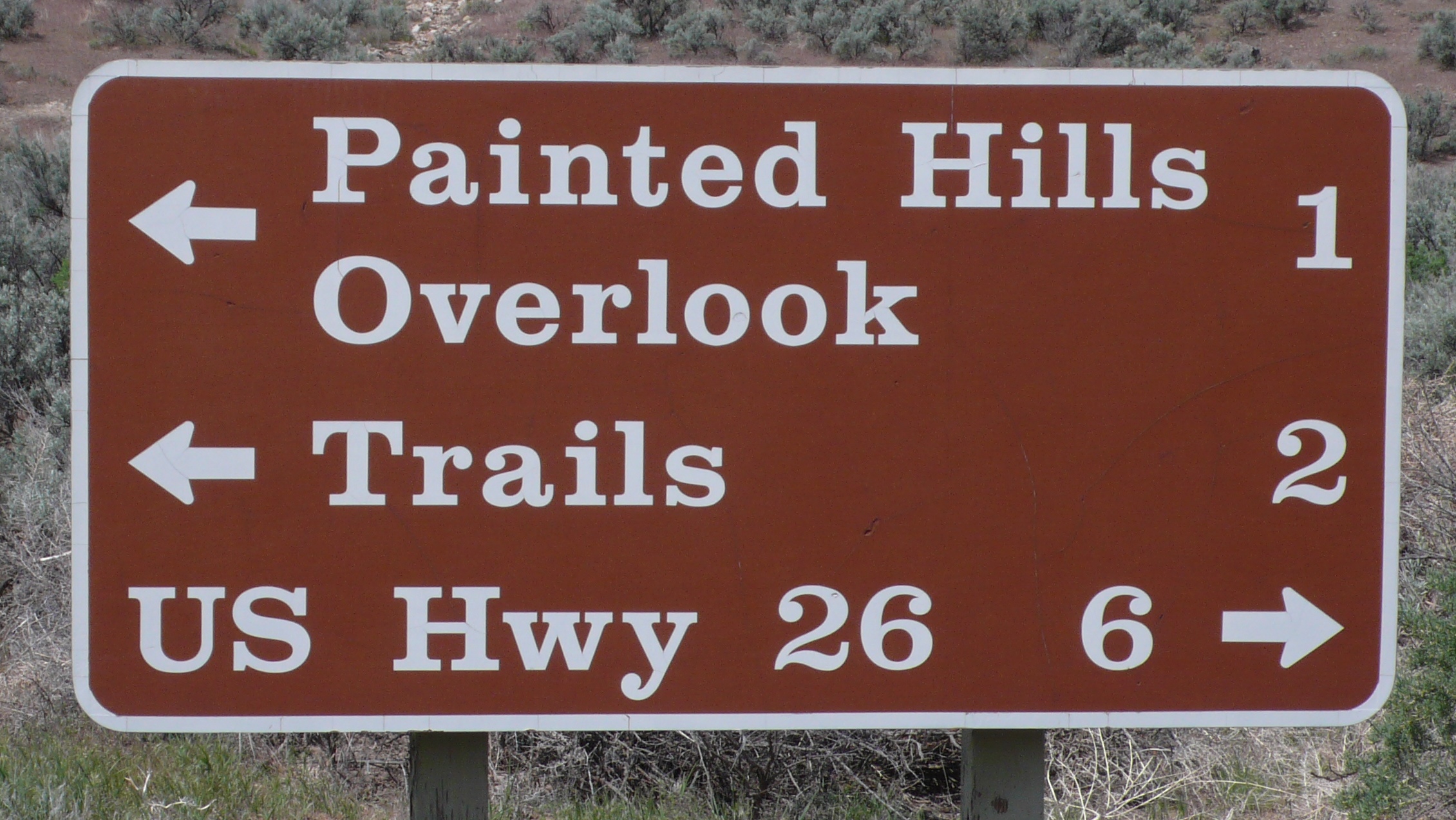
 Craw Clarendon Bold was used by the
 United States
The United States of America (U.S.A. or USA), commonly known as the United States (U.S. or US) or America, is a country Continental United States, primarily located in North America. It consists of 50 U.S. state, states, a Washington, D.C., ...
National Park Service
The National Park Service (NPS) is an agency of the United States federal government within the U.S. Department of the Interior that manages all national parks, most national monuments, and other natural, historical, and recreational properti ...
on traffic sign
Traffic signs or road signs are signs erected at the side of or above roads to give instructions or provide information to road users. The earliest signs were simple wooden or stone milestones. Later, signs with directional arms were introduce ...
s, but has been replaced by NPS Rawlinson Roadway.
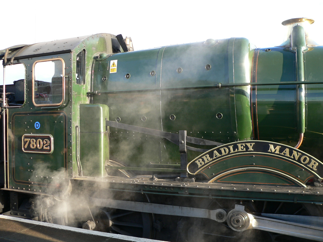
 A heavy bold Clarendon was used for the cast brass locomotive nameplates of the
 Great Western Railway
The Great Western Railway (GWR) was a British railway company that linked London with the southwest, west and West Midlands of England and most of Wales. It was founded in 1833, received its enabling Act of Parliament on 31 August 1835 and ran ...
. This was however drawn within the Swindon drawing office, not by a type foundry, and this 'Swindon Egyptian' differed in some aspects, most obviously the numerals used for the cabside numberplates.
Versions of Clarendon can also be seen in the logotypes of corporations such as Sony
, commonly stylized as SONY, is a Japanese multinational conglomerate corporation headquartered in Minato, Tokyo, Japan. As a major technology company, it operates as one of the world's largest manufacturers of consumer and professional ...
, Dave Dave may refer to:
Film, television, and theater
* ''Dave'' (film), a 1993 film starring Kevin Kline and Sigourney Weaver
* ''Dave'' (musical), a 2018 stage musical adaptation of the film
* Dave (TV channel), a digital television channel in the ...
, Pitchfork Media
''Pitchfork'' (formerly ''Pitchfork Media'') is an American online music publication (currently owned by Condé Nast) that was launched in 1995 by writer Ryan Schreiber as an independent music blog.
Schreiber started Pitchfork while working ...
, Three Twins, Wells Fargo
Wells Fargo & Company is an American multinational financial services company with corporate headquarters in San Francisco, California; operational headquarters in Manhattan; and managerial offices throughout the United States and intern ...
, the Spanish newspaper ''El País
''El País'' (; ) is a Spanish-language daily newspaper in Spain. ''El País'' is based in the capital city of Madrid and it is owned by the Spanish media conglomerate PRISA.
It is the second most circulated daily newspaper in Spain . ''El Pa ...
'', the 1961 Marvel Comics
Marvel Comics is an American comic book publisher and the flagship property of Marvel Entertainment, a divsion of The Walt Disney Company since September 1, 2009. Evolving from Timely Comics in 1939, ''Magazine Management/Atlas Comics'' in ...
official logo, some Bandung
Bandung ( su, ᮘᮔ᮪ᮓᮥᮀ, Bandung, ; ) is the capital city of the Indonesian province of West Java. It has a population of 2,452,943 within its city limits according to the official estimates as at mid 2021, making it the fourth most ...
pharmaceutical company such as Sanbe (either in company logo or on prescription medicine package), Ranbaxy
Ranbaxy Laboratories Limited was an Indian multinational pharmaceutical company that was incorporated in India in 1961 and remained an entity until 2014. The company went public in 1973. Ownership of Ranbaxy changed twice over the course of its ...
's official logo, and the Swedish house manufacturer Älvsbyhus. A custom variation of the typeface is used to display dollar amounts and other lettering on ''Wheel of Fortune The Wheel of Fortune or '' Rota Fortunae'' has been a concept and metaphor since ancient times referring to the capricious nature of Fate. Wheel of Fortune may also refer to:
Arts, entertainment, and media Art
* ''The Wheel of Fortune'' (Burne-J ...
's'' wheel.
Notes
References
{{Traffic signs Slab serif typefaces Typefaces and fonts introduced in 1845 Digital typefaces Government typefaces Display typefaces Public domain typefaces Road signs in the United States