|
Paragraph
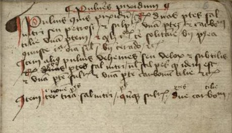
A paragraph () is a self-contained unit of discourse in writing dealing with a particular point or idea. Though not required by the orthographic conventions of any language with a writing system, paragraphs are a conventional means of organizing extended segments of prose. History The oldest classical British and Latin writings had little or no space between words and could be written in boustrophedon (alternating directions). Over time, text direction (left to right) became standardized. Word dividers and terminal punctuation became common. The first way to divide sentences into groups was the original ', similar to an underscore at the beginning of the new group. The Greek ' evolved into the pilcrow (¶), which in English manuscripts in the Middle Ages can be seen inserted inline between sentences. Ancient manuscripts also divided sentences into paragraphs with line breaks (newline) followed by an initial at the beginning of the next paragraph. An initial is an oversized c ... [...More Info...] [...Related Items...] OR: [Wikipedia] [Google] [Baidu] |
Pilcrow
In typography, the pilcrow (¶) is a glyph used to identify a paragraph. In editorial production the ''pilcrow'' typographic character is also known as the paragraph mark, the paragraph sign, the paragraph symbol, the paraph, and the blind P. In writing and editorial practice, authors and editors use the pilcrow glyph to indicate the start of separate paragraphs, and to identify a new paragraph within a long block of text without paragraph indentions, as in the book ''An Essay on Typography'' (1931), by Eric Gill. In the Middle Ages, the practice of rubrication (type in red-ink) used a red pilcrow to indicate the beginning of a different train of thought within the author's narrative without paragraphs. The letterform of the pilcrow resembles a minuscule or a mirrored majuscule , with a usually-doubled backbone reaching from the descender to the ascender height. The bowl on the left side can be filled or empty, and occasionally extends far enough downward that the c ... [...More Info...] [...Related Items...] OR: [Wikipedia] [Google] [Baidu] |
Paragraphos
A paragraphos (, , from , 'beside', and , 'to write') was a mark in ancient Greek punctuation, marking a division in a text (as between speakers in a dialogue or drama) or drawing the reader's attention to another division mark, such as the two dot punctuation mark (used as an obelism). There are many variants of this symbol, sometimes supposed to have developed from Greek gamma (), the first letter of the word . It was usually placed at the beginning of a line and trailing a little way under or over the text. It was referenced by Aristotle, who was dismissive of its use. Unicode encodes multiple versions: * * * * See also * Obelus and Obelism, Greek marginal notes * Coronis, the Greek paragraph mark * Pilcrow In typography, the pilcrow (¶) is a glyph used to identify a paragraph. In editorial production the ''pilcrow'' typographic character is also known as the paragraph mark, the paragraph sign, the paragraph symbol, the paraph, and the blind ... (¶), the Engli ... [...More Info...] [...Related Items...] OR: [Wikipedia] [Google] [Baidu] |
Newline
A newline (frequently called line ending, end of line (EOL), next line (NEL) or line break) is a control character or sequence of control characters in character encoding specifications such as ASCII, EBCDIC, Unicode, etc. This character, or a sequence of characters, is used to signify the end of a line (text file), line of text and the start of a new one. History In the mid-1800s, long before the advent of teleprinters and teletype machines, Morse code operators or telegraphists invented and used Prosigns for Morse code, Morse code prosigns to encode white space text formatting in formal written text messages. In particular, the International Morse code, Morse prosign (mnemonic break text), represented by the concatenation of literal textual Morse codes "B" and "T" characters, sent without the normal inter-character spacing, is used in Morse code to encode and indicate a ''new line'' or ''new section'' in a formal text message. Later, in the age of modern teleprinters, st ... [...More Info...] [...Related Items...] OR: [Wikipedia] [Google] [Baidu] |
Indentation (typesetting)
__FORCETOC__ In the written form of many languages, indentation describes empty space ( white space) used before or around text to signify an important aspect of the text such as: * Beginning of a paragraph * Hierarchy subordinate concept * Quotation Many computer languages use ''block indentation'' to demarcate blocks of source code. Indentation is essentially the same regardless of whether the writing system is left-to-right (e.g. Latin and Cyrillic) or right-to-left (e.g. Hebrew and Arabic) when considering line beginning and end. For example, indenting at the beginning of line means on the left for a left-to-right script and on the right for right-to-left script. Indent is both a noun and a verb. The verb is the act of formatting text to be indented whereas the noun refers to the resulting empty space. Types There are three main types of indentation: first-line, hanging and block. Each example below is in a box that represents the page boundary and uses the common ... [...More Info...] [...Related Items...] OR: [Wikipedia] [Google] [Baidu] |
En Space
An en (from English '' en quadrat'') is a typographic unit, half of the width of an em. By definition, it is equivalent to half of the body height of the typeface (e.g., in 16- point type it is 8 points). The en is sometimes referred to as the "nut", to avoid confusion with the similar-sounding "em". The en dash () and en space () are each one ''en'' wide. In English, the en dash is commonly used for inclusive ranges (e.g., "pages 12–17" or "August 7, 1988 – November 26, 2005"), to connect prefixes to open compounds (e.g., "pre–World War II"). The en-dash is also increasingly used to replace the long dash ("—", also called an em dash or em rule). When using it to replace a long dash, spaces are needed either side of it – like so. This is standard practice in the German language, where the hyphen is the only dash without spaces on either side ( line breaks are not spaces ''per se''). History Some sources claim the term "en" was derived from the letter "n", which ... [...More Info...] [...Related Items...] OR: [Wikipedia] [Google] [Baidu] |
World Wide Web
The World Wide Web (WWW or simply the Web) is an information system that enables Content (media), content sharing over the Internet through user-friendly ways meant to appeal to users beyond Information technology, IT specialists and hobbyists. It allows documents and other web resources to be accessed over the Internet according to specific rules of the HTTP, Hypertext Transfer Protocol (HTTP). The Web was invented by English computer scientist Tim Berners-Lee while at CERN in 1989 and opened to the public in 1993. It was conceived as a "universal linked information system". Documents and other media content are made available to the network through web servers and can be accessed by programs such as web browsers. Servers and resources on the World Wide Web are identified and located through character strings called uniform resource locators (URLs). The original and still very common document type is a web page formatted in Hypertext Markup Language (HTML). This markup lang ... [...More Info...] [...Related Items...] OR: [Wikipedia] [Google] [Baidu] |
Email
Electronic mail (usually shortened to email; alternatively hyphenated e-mail) is a method of transmitting and receiving Digital media, digital messages using electronics, electronic devices over a computer network. It was conceived in the late–20th century as the digital version of, or counterpart to, mail (hence ''wikt:e-#Etymology 2, e- + mail''). Email is a ubiquitous and very widely used communication medium; in current use, an email address is often treated as a basic and necessary part of many processes in business, commerce, government, education, entertainment, and other spheres of daily life in most countries. Email operates across computer networks, primarily the Internet access, Internet, and also local area networks. Today's email systems are based on a store-and-forward model. Email Server (computing), servers accept, forward, deliver, and store messages. Neither the users nor their computers are required to be online simultaneously; they need to connect, ty ... [...More Info...] [...Related Items...] OR: [Wikipedia] [Google] [Baidu] |
Robert Bringhurst
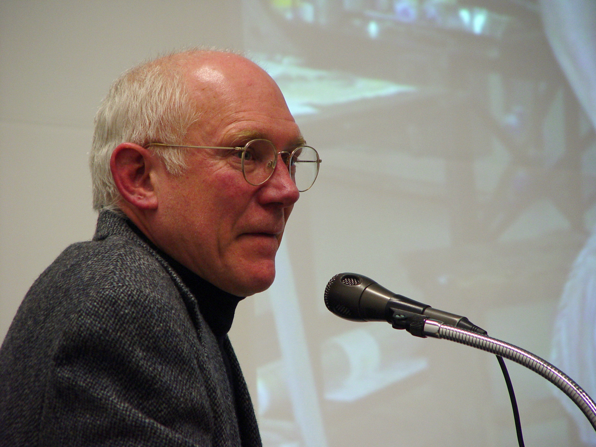
Robert Bringhurst Appointments to the Order of Canada (2013). (born 1946) is a CanadianWong (1999). poet, typographer and author. He has translated substantial works from Haida and Navajo and from classical Greek and Arabic. He wrote ''The Elements of Typographic Style'', a reference book of typefaces, glyphs and the visual and geometric arrangement of type. He was named an Officer of the Order of Canada in June 2013. He lives on Quadra Island, near Campbell River, British Columbia (approximately 170 km northwest of Vancouver) with his wife, Jan Zwicky, a poet and philosopher. Life Bringhurst was born on October 16, 1946, in Los Angeles, California, and raised in Utah, Montana, Wyoming, Alberta, and British Columbia. He studied architecture, linguistics, and physics at the Massachusetts Institute of Technology, and comparative literature and philosophy at the University of Utah. He holds a BA from Indiana University (1973) and an MFA in creative writing from the Univ ... [...More Info...] [...Related Items...] OR: [Wikipedia] [Google] [Baidu] |
Miles Tinker
Miles Albert Tinker (August 22, 1893 – March 4, 1977) was an American author. He is "an internationally recognized authority on legibility of print" who published the results of some of the most comprehensive studies on the legibility of print ever conducted. According to Jeremy York, Tinker's work, along with his colleague Donald G. Paterson, "was a driving force behind the standardization of the print industry in the United States". Tinker conducted studies on the effect of typography on reading at the University of Minnesota for 32 years. "Much of what is known—rather than intuitively felt—about type legibility is derived from Tinker’s work." He published prolifically in various journals during this period. Tinker also authored or co-authored seven books. ''Legibility of Print'', published in 1963, summarized the results of his studies in 1927–1959 and is the "seminal study on how we read printed type". Tinker was also a critic. In reviewing a book by Wolfe et al., ''I ... [...More Info...] [...Related Items...] OR: [Wikipedia] [Google] [Baidu] |
Em Space
An em (from '' em quadrat'') is a unit in the field of typography, equal to the currently specified point size. It corresponds to the body height of the typeface. For example, one em in a 16-point typeface is 16 points. Therefore, this unit is the same for all typefaces at a given point size. The em space is one ''em'' wide. Typographic measurements using this unit are frequently expressed in decimal notation (e.g., 0.7 em) or as fractions of 100 or 1000 (e.g., em or em). The number of pixels per em varies depending on system. History In metal type, the point size (and hence the ''em'', from '' em quadrat'') was equal to the line height of the metal body from which the letter rises. In metal type, the physical size of a letter could not normally exceed the em. A digital font's design space in digital type is called the em, which is a grid with arbitrary resolution. Scaling the em to a particular point size is how imaging systems—whether for screen ... [...More Info...] [...Related Items...] OR: [Wikipedia] [Google] [Baidu] |


