|
Verdana
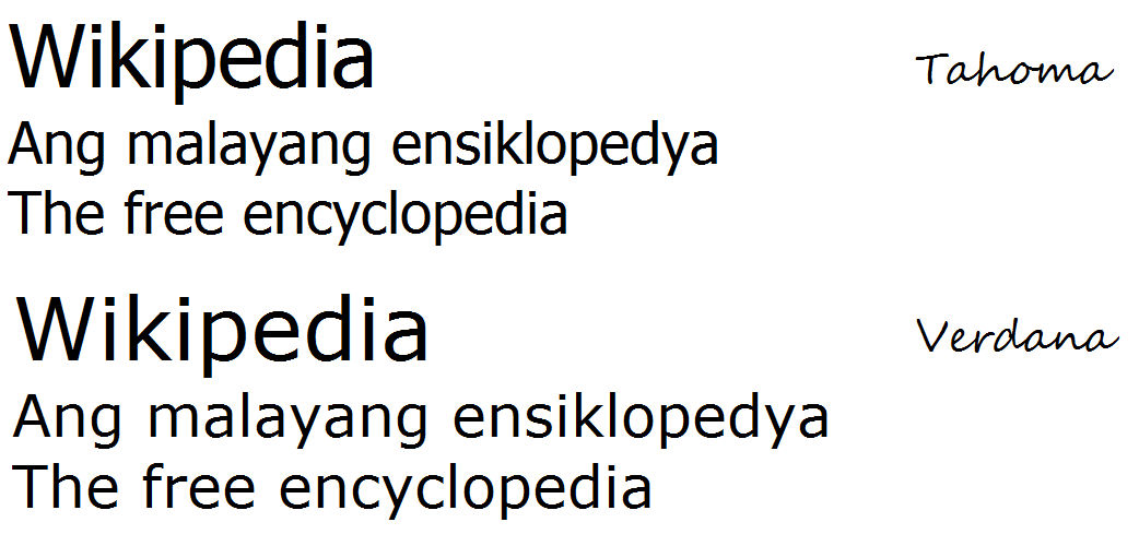
Verdana is a humanist sans-serif typeface designed by Matthew Carter for Microsoft Corporation, with hand- hinting done by Thomas Rickner, then at Monotype. Demand for such a typeface was recognized by Virginia Howlett of Microsoft's typography group and commissioned by Steve Ballmer. The name "Verdana" is derived from " verdant" (green) and "Ana" (the name of Howlett's eldest daughter). Bearing similarities to humanist sans-serif typefaces such as Frutiger, Verdana was designed to be readable at small sizes on the low-resolution computer screens of the period. Like many designs of this type, Verdana has a large x-height (tall lower-case characters), with wider proportions and looser letter-spacing than on print-orientated designs like Helvetica. The counters and apertures are wide, to keep strokes clearly separate from one another, and similarly shaped letters are designed to appear clearly different to increase legibility for body text. The bold weight is thicker than wo ... [...More Info...] [...Related Items...] OR: [Wikipedia] [Google] [Baidu] |
Matthew Carter
Matthew Carter (born 1 October 1937) is an English type designer.A Man of Letters , U.S. News & World Report, 1 September 2003. A 2005 ''The New Yorker, New Yorker'' profile described him as 'the most widely read man in the world' by considering the amount of text set in his commonly used typefaces. Carter's career began in the early 1960s and has bridged all three major technologies used in type design: metal type, physical type, phototypesetting and digital type design, as well as the design of custom lettering. Carter's most used typefaces are the classic web typefaces Verdana and Georgia (typeface), Georgia and the Microsoft Windows, Windows interface typeface Tahoma (typeface), Tahoma, as well as other designs including Bell Centennial, Mille ... [...More Info...] [...Related Items...] OR: [Wikipedia] [Google] [Baidu] |
Tahoma (typeface)
Tahoma is a humanist sans-serif typeface that Matthew Carter designed for Microsoft Corporation. Microsoft first distributed it, along with Carter's Verdana, as a computer font with Office 97. While similar to Verdana, Tahoma has a narrower body, smaller counters, much tighter letter spacing, and a more complete Unicode character set. Carter first designed Tahoma as a bitmap font, then "carefully wrapped" TrueType outlines around those bitmaps. Carter based the bold weight on a double pixel width, rendering it closer to a heavy or black weight. In contrast with some other sans-serif typefaces, including Arial, the uppercase "" (eye) is distinguishable from lowercase "" (ell), which is especially important in technical publications. Since 2010, Ascender Corporation has offered italic and small caps versions of Tahoma. In an interview by Daniel Will-Harris, Carter acknowledged that Tahoma has some similarities with his earlier Bell Centennial typeface. The Tahoma typeface ... [...More Info...] [...Related Items...] OR: [Wikipedia] [Google] [Baidu] |
Meiryo
is a Japanese sans-serif gothic typeface. Microsoft bundled Meiryo with Office Mac 2008 as part of the standard install, and it replaces MS Gothic as the default system font on Japanese systems beginning with Windows Vista. Meiryo was created out of a growing need for legible CJK fonts compatible with Microsoft ClearType's hinting and subpixel rendering system. It was meant to increase the legibility of Japanese text on LCD screens, and would thus take the place of MS Gothic and MS Mincho, both of which had been widely used at the time. While most Latin fonts were able to use hinting at any size, most CJK fonts were incompatible with the technology (with the exception of some fonts such as Arial Unicode MS). Meiryo did away with embedding bitmap images into fonts for use at small sizes, a strategy employed by many CJK fonts (including MS Gothic and MS Mincho) to compensate for a lack of hinting support. Meiryo UI Meiryo UI is a version that uses condensed kana and reduce ... [...More Info...] [...Related Items...] OR: [Wikipedia] [Google] [Baidu] |
Thomas Rickner
Thomas Rickner (born October 8, 1966, Rochester, New York) is an American type designer who, while Lead Typographer at Apple Inc., supervised the production of the first TrueType fonts released in 1991 as part of Apple’s System 7 operating system for the Macintosh. Rickner provided TrueType production and font hinting of Matthew Carter’s Georgia, Verdana, and Tahoma typeface families, commissioned by Microsoft and widely distributed in the Windows operating system and Apple’s Mac OS X. Rickner’s original type designs include Amanda, Buffalo Gal and Hamilton. Rickner began his career in type design in 1987 as a bitmap editor for Omnipage Corporation, of Rochester, New York. In 1988, he was graduated from the Rochester Institute of Technology School of Printing Management and Sciences with a bachelor's degree, and started at QMS/Imagen Corporation, a laser printer manufacturer in Santa Clara, California. There, under the direction of noted type designer Charles Bigelow, ... [...More Info...] [...Related Items...] OR: [Wikipedia] [Google] [Baidu] |
Typeface
A typeface (or font family) is a design of Letter (alphabet), letters, Numerical digit, numbers and other symbols, to be used in printing or for electronic display. Most typefaces include variations in size (e.g., 24 point), weight (e.g., light, bold), slope (e.g., italic), width (e.g., condensed), and so on. Each of these variations of the typeface is a font. There are list of typefaces, thousands of different typefaces in existence, with new ones being developed constantly. The art and craft of designing typefaces is called type design. Designers of typefaces are called type designers and are often employed by type foundry, type foundries. In desktop publishing, type designers are sometimes also called "font developers" or "font designers" (a typographer is someone who ''uses'' typefaces to design a page layout). Every typeface is a collection of glyphs, each of which represents an individual letter, number, punctuation mark, or other symbol. The same glyph may be used for ch ... [...More Info...] [...Related Items...] OR: [Wikipedia] [Google] [Baidu] |
Font Hinting
Font hinting, also known as instructing, is the use of mathematical instructions to adjust the display of an outline font so that it lines up with a rasterized grid. At low screen resolutions, hinting is critical for producing clear, legible text. It can be accompanied by antialiasing and (on liquid crystal displays) subpixel rendering for further clarity. Overview For the purpose of on-screen text display, font hinting designates which primary pixels are interpolated to more clearly render a font. Hints are usually created in a font editor during the typeface design process and embedded in the font. A font can be hinted either automatically (through processed algorithms based on the character outlines) or set manually. Most font editors are able to do automatic hinting, and this approach is suitable for many fonts. However, high-quality commercial fonts are often manually hinted to provide the sharpest appearance on computer displays. Verdana is one example of a font t ... [...More Info...] [...Related Items...] OR: [Wikipedia] [Google] [Baidu] |
Bitstream Vera Sans
Vera is a digital typeface (computer font) superfamily with a liberal license. It was designed by Jim Lyles from the now-defunct Bitstream Inc. type foundry, and it is closely based on Bitstream Prima, for which Lyles was also responsible. It is a TrueType font with full hinting instructions, which improve its rendering quality on low-resolution devices such as computer monitors. The font has also been repackaged as a Type 1 PostScript font, called ''Bera'', for LaTeX users. Vera consists of serif, sans-serif, and monospace fonts. The Bitstream Vera Sans Mono typeface in particular is suitable for technical work, as it clearly distinguishes "l" (lowercase L) from "1" (one) and "I" (uppercase i), and "0" (zero) from "O" (uppercase o), in similar fashion as Verdana and Tahoma fonts. Bitstream Vera Sans is also the default font used by the Python library Matplotlib to produce plots. Unicode coverage Bitstream Vera itself covers Basic Latin and Latin 1-Supplement lette ... [...More Info...] [...Related Items...] OR: [Wikipedia] [Google] [Baidu] |
Virginia Howlett
Virginia Howlett (born 1951 in Edmonton, Alberta) is a designer and painter. With an MFA in Painting from The Art Institute of Chicago, Howlett was one of the first designers hired into Microsoft in 1985. After writing an email to Bill Gates explaining the necessity for having designated graphic user interface designers, she built the company's first user interface design team. She led the team that designed the 3D graphic interface for Windows 95. She was also instrumental in starting Microsoft's corporate art collection. Working in Microsoft's typography group, she collaborated with Matthew Carter to develop a number of typefaces including '' Verdana'' (which is named after her daughter, Ana). In 1996 her book ''Visual Interface Design for Windows'' was published. In it, she explains the design process and provides a number of makeovers of real-world software products. It is recognized as one of the first books to bridge the gap between artistic product designers and techni ... [...More Info...] [...Related Items...] OR: [Wikipedia] [Google] [Baidu] |
Frutiger (typeface)
Frutiger (pronounced ) is a series of typefaces named after its Swiss designer, Adrian Frutiger. Frutiger is a humanist sans-serif typeface, intended to be clear and highly legible at a distance or at small text sizes. A popular design worldwide, type designer Steve Matteson described its structure as "the best choice for legibility in pretty much any situation" at small text sizes, while Erik Spiekermann named it as "the best general typeface ever". Distinctive characteristics Characteristics of this typeface are: ;Lowercase: square dot over the letters ''i'' and ''j''; double-storey ''a'', single-storey ''g''. Wide, open apertures on letters such as ''a'', ''e'' and ''s''. Very high x-height, increasing its clarity. ;Uppercase: Wide ''A'' with a very low centre bar, though less obvious in bold weight. ''Q'' with a stroke below the circle only. Univers-like ''M'', square and with centre strokes descending to the base of the letter. ;Figures: diagonal serif on the ''1''; clos ... [...More Info...] [...Related Items...] OR: [Wikipedia] [Google] [Baidu] |
Sans-serif
In typography and lettering, a sans-serif, sans serif (), gothic, or simply sans letterform is one that does not have extending features called "serifs" at the end of strokes. Sans-serif typefaces tend to have less stroke width variation than serif typefaces. They are often used to convey simplicity and Modern typography, modernity or minimalism. For the purposes of type classification, sans-serif designs are usually divided into these major groups: , , , , and . Sans-serif typefaces have become the most prevalent for display of text on computer screens. On lower-resolution digital displays, fine details like serifs may disappear or appear too large. The term comes from the French word , meaning "without" and "serif" of uncertain origin, possibly from the Dutch word meaning "line" or pen-stroke. In printed media, they are more commonly used for Display typeface, display use and less for body text. Before the term "sans-serif" became standard in English typography, a number of ... [...More Info...] [...Related Items...] OR: [Wikipedia] [Google] [Baidu] |
Helvetica
Helvetica, also known by its original name Neue Haas Grotesk, is a widely-used sans-serif typeface developed in 1957 by Swiss typeface designer Max Miedinger and Eduard Hoffmann. Helvetica is a neo-grotesque design, one influenced by the famous 19th-century (1890s) typeface Akzidenz-Grotesk and other German and Swiss designs. Its use became a hallmark of the International Typographic Style that emerged from the work of Swiss designers in the 1950s and 1960s, becoming one of the most popular typefaces of the mid-20th century. Over the years, a wide range of variants have been released in different weights, widths, and sizes, as well as matching designs for a range of non-Latin alphabets. Notable features of Helvetica as originally designed include a high x-height, the termination of strokes on horizontal or vertical lines and an unusually tight spacing between letters, which combine to give it a dense, solid appearance. Developed by the ''Haas'sche Schriftgiesserei'' ( Haa ... [...More Info...] [...Related Items...] OR: [Wikipedia] [Google] [Baidu] |


